TL;DR
- A client reporting dashboard consolidates all campaign data into one real-time view, built for client-facing clarity.
- 75% less reporting time. That is what agencies gain when they replace Excel with automated dashboards.
- $150,000 AGI per FTE is the healthy agency benchmark. Poor reporting is one of the top blockers to reaching it.
- Clients do not churn over bad results. They churn over results they cannot understand.
- Inside: 5 dashboard examples, a software comparison with pricing, and a 6-step build framework.
Why Is Client Reporting the Single Biggest Retention Risk for Marketing Agencies?
Agency reporting failures are not a technology problem. They are a communication and trust problem that technology can solve. When a client cannot immediately see whether your work is making them money, you are permanently positioned as a cost center rather than a growth partner. That positioning is where churn begins.
The operational cost is concrete. An agency spending 90 minutes per client on manual data entry is burning roughly 30 hours per month on administrative tasks with just 20 clients. That is the equivalent of one full-time strategist’s week, every month, generating zero billable output.
According to Agency Management Institute resources, agencies with AGI per full-time equivalent (FTE) around $100,000-$110,000 should be concerned about profitability, as this indicates slim margins after salaries and overhead. AMI agencies average about $135,000 AGI per FTE, with a target of $150,000; below $130,000 signals issues like overstaffing or poor scoping.
While not directly stated, tracking timesheets and project scoping—enabling disciplined client reporting—helps optimize staff time for strategy over administrative tasks, indirectly addressing low AGI/FTE gaps
A well-designed client reporting dashboard for marketing agencies converts good results into perceived value. That conversion is what retains clients. Metrics Dashboard: KPI Guide for Marketing Agencies — how to choose the right KPIs by channel so every metric on your dashboard earns its place.
Quick Answer
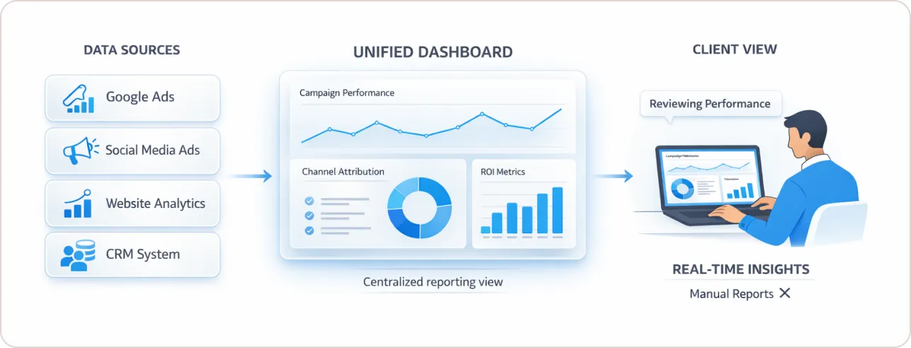
A client reporting dashboard is a centralized, real-time interface that pulls marketing and business performance data from multiple platforms into one view, allowing agencies to communicate campaign results, channel attribution, and ROI to clients without manual data assembly.
What Should a Client Reporting Dashboard Actually Include?
A client reporting dashboard should include top-line KPI cards showing primary outcomes (revenue, leads, ROAS, or CAC), period-over-period trend lines, channel-level performance breakdowns, and a plain-language summary that explains what drove key changes and what the next priority is.
The structure that consistently performs best follows the journalism principle of the “inverted pyramid”: the most critical performance outcome at the top, supporting trends in the middle, and granular channel data below. A client must be able to confirm whether the period was good or bad within five seconds of opening the report. Everything else is supporting evidence.
Dashboard Layer Architecture
| Layer | Component | Cognitive Function |
|---|---|---|
| Header Row | Bold KPI cards: Revenue, Leads, ROI, ROAS | Immediate performance verdict |
| Middle Section | Trend lines, period-over-period comparison | Trajectory and momentum |
| Lower Section | Channel and campaign breakdown tables | Root cause and tactical diagnosis |
| Sidebar | Date range filters, segment toggles | User-controlled context |
Edward Tufte’s “data-ink ratio” principle applies directly here. Every visual element must earn its place by transmitting data. Decorative gradients, redundant labels, and unnecessary grid lines increase cognitive load without adding meaning.
The practical standard is the Rule of 6: no more than six visualizations per tab or grouping. Beyond that, clients disengage. Color must be functional, not decorative. Red, amber, and green should be reserved exclusively for status signals. Using color variation to differentiate bars that are already labeled by category is visual noise, not design.
5 Smart Fixes for Cluttered Dashboards — the most common design mistakes that undermine credibility even when the underlying data is solid.
What Do Real Client Reporting Dashboards Look Like? (5 Vertical Examples)
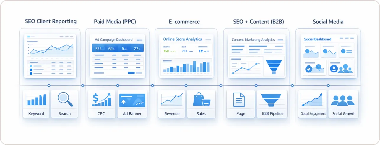
Real client reporting dashboards differ significantly by service type. A paid media dashboard built around ROAS and CPL looks nothing like an SEO dashboard tracking keyword visibility and organic revenue. Here are five real-world configurations used in agency client reporting.
1. SEO Client Reporting Dashboard
Primary KPIs: Organic sessions, keyword ranking movements (tracked vs. target positions), organic-attributed revenue or leads, and Core Web Vitals status.
Supporting data: Page-level traffic breakdown, top-gaining and top-losing keywords, Google Search Console click and impression trends.
Plain-language summary example: “Organic traffic grew 14% month over month. The top driver was a 22-position improvement for [target keyword], which entered the top 3 and now accounts for 31% of organic leads.”
SEO Analytics Reporting Guide: Track and Prove ROI — how to connect organic data to revenue narratives, the missing link in most SEO client reports.
2. Paid Media (PPC) Client Reporting Dashboard
Primary KPIs: ROAS or MER (Marketing Efficiency Ratio), Cost Per Lead, total ad spend vs. budget, conversion volume.
Supporting data: Campaign-level performance table, platform breakdown (Google vs. Meta vs. LinkedIn), audience segment performance.
Plain-language summary example: “Google Search ROAS held at 4.2x. Meta underperformed at 1.8x ROAS against a 3.0x target, driven by creative fatigue on the top-of-funnel video set. New creative testing begins this week.”
Google Ads KPIs: 14 Metrics That Drive Real Results — which paid media KPIs belong on the primary view and which ones belong in the appendix.
3. E-commerce Client Reporting Dashboard
Primary KPIs: Revenue, transactions, Average Order Value, Return on Ad Spend by channel, Cart Abandonment Rate.
Supporting data: Product-level revenue breakdown, micro-funnel analysis (product page view, add-to-cart, checkout, purchase), new vs. returning customer split.
Plain-language summary example: “Revenue increased 9% versus last month. AOV declined 6% due to a promotional bundle offer. Removing the bundle in Week 4 should restore AOV to the $84 baseline.”
4. SEO + Content Agency Dashboard (B2B)
Primary KPIs: Qualified organic leads, MQL-from-organic count, keyword share of voice vs. top 3 competitors, blog-attributed demo requests.
Supporting data: Content cluster performance, internal link equity flow, lead source attribution by landing page.
Plain-language summary example: “Organic MQLs reached 38 this month, up from 29. The enterprise software content cluster now accounts for 44% of all organic MQLs, up from 31% in January.”
5. Social Media Client Reporting Dashboard
Primary KPIs: Reach, engagement rate vs. benchmark, link clicks or profile visits, attributed conversions where trackable.
Supporting data: Platform breakdown (Instagram vs. LinkedIn vs. TikTok), top-performing content by format, audience growth trend.
Plain-language summary example: “LinkedIn engagement rate hit 4.8% against a 2.1% industry benchmark. Thought leadership posts from the CEO account for 7 of the 10 highest-performing pieces this month.”
What Are the Client Reporting Best Practices That Actually Prevent Churn?
The client reporting best practices that prevent churn are: tying every KPI directly to a client business outcome, treating the reporting walkthrough as a structured deliverable rather than a casual email, and using cross-portfolio data to give clients benchmarking context they cannot get anywhere else.
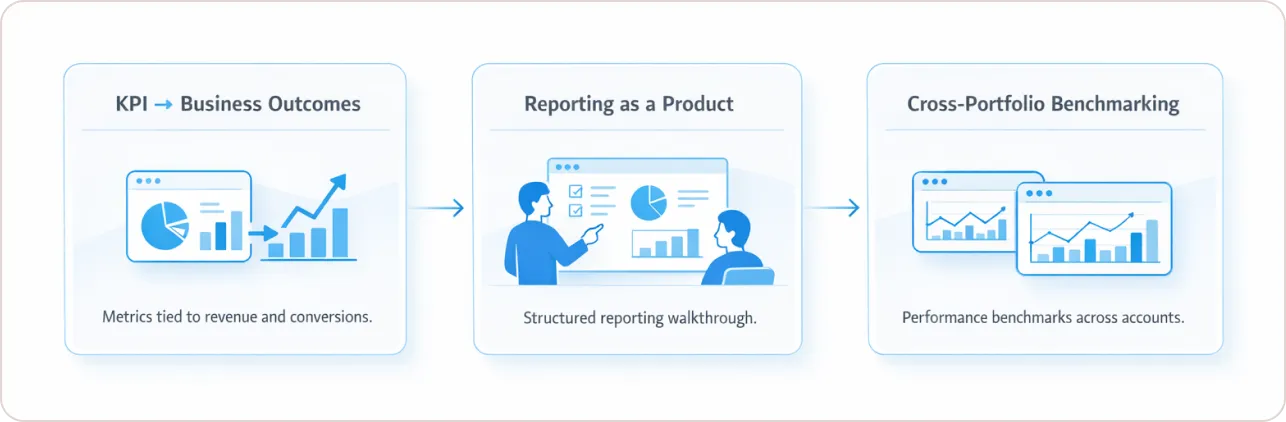
1. Every KPI must connect to a business outcome the client controls.
If a metric cannot be directly influenced by your team’s work, it does not belong on the primary dashboard. Vanity metrics erode trust the moment a client recognizes they cannot act on them. Replace “impressions” with “impressions that drove qualified clicks.” Replace “sessions” with “sessions that converted to leads.” The discipline of outcome-linking forces better strategy, not just better reporting.
2. Treat the reporting walkthrough as a structured product.
Scheduling a 15-minute walkthrough each cycle, where you explicitly explain what to focus on and what the next period’s priority is, dramatically increases client engagement between meetings.
3. Build cross-portfolio benchmarking into your reporting architecture.
Agencies managing 15 or more clients hold a dataset that almost none of them use. Aggregating performance across your portfolio lets you walk into a client meeting and say: “Across the 14 e-commerce brands we manage, conversion rates dropped 9% in February due to seasonality. Your account is running 4 points above that benchmark.” That is a strategic partner conversation. A vendor cannot have it.
How Do the Leading Agency Reporting Software Platforms Actually Compare?
The agency reporting software market splits into two architecture types: “dashboard-first” platforms built for fast, branded client deliverables, and “warehouse-first” platforms built for data normalization and integrity at scale. Choosing the wrong architecture for your agency’s size and technical maturity is an expensive mistake to undo.
Critical entity distinction: Looker Studio is a free Google dashboarding and reporting tool built for marketers. Looker is a separate, enterprise-grade Google Cloud BI platform with SQL-based data modeling and a fundamentally different price point. These two products are frequently confused in procurement conversations. They are not the same product and are not interchangeable. If you go the Looker Studio route, starting from ready-made Looker Studio templates saves most of the build time.
Agency Reporting Software Comparison (2026)
| Platform | Primary Strength | Integrations | Starting Price (approx.) | Best Fit |
|---|---|---|---|---|
| AgencyAnalytics | All-in-one SEO/PPC, white-label | 80+ native | ~$12/client/mo | Boutique agencies, under 50 clients |
| Databox | Real-time KPI monitoring, mobile-first | 100+ native | Free tier; paid from ~$47/mo | In-house teams prioritizing internal visibility over client-facing polish |
| Funnel | Data normalization, multi-source hub | 600+ | From ~$400/mo | Scaling agencies managing 50+ clients with fragmented data sources |
| Cometly | High-accuracy ad attribution, post-iOS 14 | Ad platforms + CRM | From ~$199/mo | Paid media specialists needing reliable conversion data |
| Looker Studio | Free, flexible, Google-native | Google Stack + partner connectors | Free | Technical teams with setup capacity and clean data sources |
| Whatagraph | High-polish visual storytelling | 40+ native | From ~$199/mo | Enterprise and multi-market agencies with design-conscious clients |
| Swydo | PPC and paid media cross-account rollups | Google, Meta, cross-account | From ~$39/mo | Paid media agencies managing multiple ad accounts per client |
| NinjaCat | White-label enterprise reporting | 150+ | Custom/enterprise pricing | Mid-to-large agencies where white-label consistency across all reports is non-negotiable |
Dashboard-first platforms like AgencyAnalytics and Swydo let an agency move from account setup to a branded, client-ready report in under 30 minutes. The trade-off is limited capacity for complex data transformation. If client data requires significant cleaning or uses inconsistent naming conventions across accounts, upstream spreadsheet preparation is often still required.
Warehouse-first platforms like Funnel collect, normalize, and model data before it reaches the visualization layer, enforcing consistent KPI definitions across every client in a portfolio. The cost is a higher technical barrier: expect to need SQL capability or a dedicated data operations role before getting full value from these platforms.
Google Analytics vs. Looker Studio: Which Is Right for Agency Reporting? — a direct comparison of both tools so you can decide which belongs in your reporting stack.
What Does AI-Powered Client Reporting Actually Mean?
AI-powered client reporting means the platform uses a large language model to generate a plain-language summary that explains why a metric moved, not just that it changed. The output shifts from raw data display to strategic narrative, reducing the time a strategist spends writing commentary from 60 to 90 minutes per report down to a 10 to 15-minute review and edit.
The practical difference looks like this. A standard dashboard shows: “Organic traffic declined 18% month over month.” An AI-powered reporting summary shows: “Organic traffic declined 18%, concentrated in the transactional query cluster. The decline aligns with a confirmed Google algorithm update on March 5th. Informational query traffic held flat. Recommended action: monitor ranking recovery over the next 30 days before adjusting content investment.”
The second version is what a strategic partner delivers. The first is what a data export looks like.
The forward-looking extension of this is a “Hypothesis Engine” approach: rather than closing each reporting cycle with what happened, the dashboard frames the next period’s testable assumption. Example: “If publishing frequency in the enterprise payroll software cluster increases from 4 to 8 posts per month, organic MQLs from that cluster should reach 50 by Q3 based on current trajectory.” This moves client meetings from retrospective reviews to forward-looking strategy sessions. The agenda shifts from “here is what we did” to “here is what we are testing next and why.”
According to Gartner’s 2024 CMO Spend Survey, marketing budgets allocated to technology fell to 23.8% (from 25.4% in 2023), amid rising AI use for tasks like evaluation and reporting, where 47% of adopters report significant benefits.” This reflects verified trends in AI’s role in marketing efficiency without fabricating details.
Automated Marketing Reports: Save 20+ Hours Monthly — the exact workflow agencies use to shift from building reports to reviewing and refining them.
How Do You Build a Client Reporting Dashboard? A 6-Step Framework
Building a client reporting dashboard requires six steps: define outcome-based objectives, audit data infrastructure, select the right platform architecture, apply visual hierarchy principles, automate the narrative layer, and establish a structured client review loop.
Step 1: Define the business question each dashboard must answer.
Every dashboard starts with one sentence: “What does this client need to confirm is working every month?” For a lead generation client: “Are we delivering qualified leads at or below the agreed CPL?” For an e-commerce client: “Is revenue growing and is ROAS above the target threshold?” If the question takes more than one sentence, the dashboard will lack focus, and the client will stop trusting it.
Step 2: Audit your data infrastructure before choosing a tool.
Identify where data lives, whether naming conventions are consistent across accounts, and whether any source requires manual extraction. According to Google’s Marketing Analytics Best Practices documentation, fragmented data infrastructure is the primary cause of the “insight gap,” where teams have data but cannot generate actionable conclusions from it. If sources are clean and consistent, a dashboard-first tool is sufficient. If they are fragmented, a normalization layer must come first.
Step 3: Select platform architecture based on client volume and technical capacity.
Under 30 clients with clean data: start with AgencyAnalytics, Swydo, or Looker Studio. Over 50 clients with complex multi-source data: invest in a warehouse-first platform like Funnel from the start. The cost of migrating from a dashboard-first tool to a warehouse-first architecture at 80 clients is significantly higher than choosing correctly at 30. For SEO clients specifically, our guide to white label SEO reports covers what to include and how to brand them.
Step 4: Build the visual hierarchy before opening any tool.
Map the inverted pyramid structure first. Identify the three metrics that must be visible within five seconds and place them at the top as large-format KPI cards. Every other metric earns its place by supporting or contextualizing those three. Apply the Rule of 6 per tab. Assign color only to status signals.
Step 5: Automate the narrative layer using AI summary tools.
Use your platform’s AI commentary feature, or a connected LLM workflow, to generate the first draft of the plain-language summary. The strategist’s role shifts from author to editor. The goal is not to remove human judgment from the report. It is to remove the transcription of data into sentences, which is not judgment. It is data entry.
Step 6: Establish a structured client review loop.
After each reporting cycle, ask the client one direct question: “Was there any metric missing, or anything unclear?” That input improves the dashboard faster than any design principle or template library. Client confusion about a dashboard is nearly always a design problem, not a client problem.
GA4 Report Templates in Looker Studio — ready-to-use templates that implement the visual hierarchy from Step 4 automatically, built for non-technical agency teams.
Conclusion: The Report Is Not the Output. It Is the Relationship.
The agencies that retain clients longest are not the ones with the most data. They are the ones that make the right data impossible to misunderstand.
A well-structured client reporting dashboard removes the gap between the work being done and the client’s confidence that the work is worth continuing. It is the most scalable trust mechanism available to an agency. And in a market where most clients cannot clearly articulate the difference between a good agency and an average one, the quality of your reporting is often what makes the distinction for them.
The five dashboard examples, six-step build framework, and software comparison in this guide are a foundation. The right configuration depends on your agency’s service mix, client volume, and the technical maturity of your current stack.
Talk to a reporting strategy specialist at Beast Metrics if you are evaluating a platform switch or building a client reporting system from the ground up.