TL;DR
- A metrics dashboard is a centralized display of your most critical KPIs, turning raw data into decisions.
- 74% of decision-makers prefer fewer, more actionable metrics over exhaustive data dumps (Forrester Research).
- The best dashboards are built around questions, not data — start with the decision, then choose the metric.
- Separating dashboards into strategic (monthly), tactical (weekly), and operational (daily) tiers eliminates analysis paralysis.
- Looker Studio is the most accessible free platform for building client-ready metrics dashboards without coding.
Quick Answer
A metrics dashboard is a visual interface that consolidates KPIs from multiple data sources into one centralized display, enabling organizations to monitor performance, identify trends, and make data-driven decisions in real time.
Every agency faces the same painful moment: a client pulls up last month’s report and asks, “So what does all this mean for my business?” The room goes quiet. The account manager scrambles through tabs of raw numbers. It is not a data problem. It is a metrics dashboard problem.
Hundreds of dashboards have been built and audited for agencies, from five-person boutiques to mid-market firms managing $10M+ in media spend. The pattern is consistent: agencies that win client retention battles are not the ones with the most data. They are the ones with the clearest, most decision-oriented dashboard metrics. This guide walks through exactly how to build them.
What Is a Metrics Dashboard and Why Does It Matter?
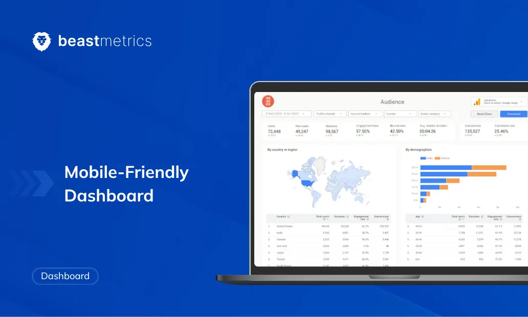
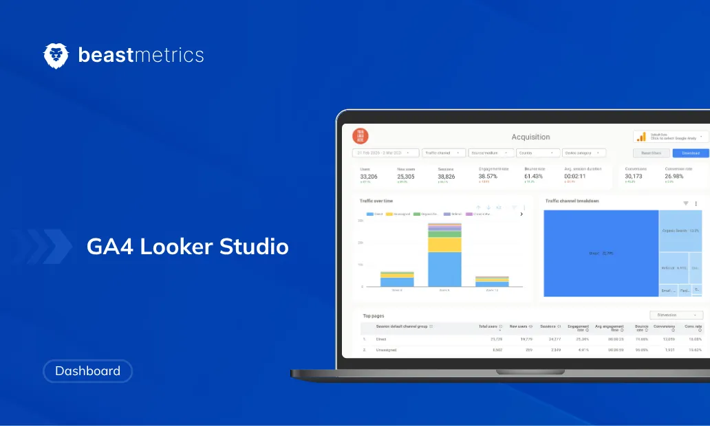
A metrics dashboard is a visual interface that consolidates data from multiple sources into a single, real-time display of an organization’s most important Key Performance Indicators (KPIs). A well-built business metrics dashboard answers one question above all others: what decision should we make right now?
The stakes are real. According to Forrester Research, 74% of business decision-makers say they prefer fewer, more actionable metrics over comprehensive data reports. Yet most agency dashboards do the opposite — they aggregate everything, explain nothing, and leave clients more confused than informed.
That gap is exactly the opportunity. When your metrics and dashboards tell a clear story, you stop being a vendor and start being a trusted strategic partner. And trusted partners do not get fired when one month underperforms.
What Is the Difference Between a Metric and a KPI?
A metric is any quantifiable measurement of activity. A KPI (Key Performance Indicator) is a metric tied directly to a business objective with a defined target. Every KPI is a metric, but not every metric is a KPI — this distinction matters enormously for dashboard design.
For example, page views are a metric. Organic conversion rate by landing page is a KPI because it connects traffic behavior directly to lead generation goals. HubSpot’s research on marketing measurement consistently shows that teams tracking revenue-connected KPIs are 1.6x more likely to exceed their annual targets than those tracking activity metrics alone.
When building a key metrics dashboard, the filter is simple: if a data point does not inform a specific business decision, it does not belong on the primary view. Understanding this distinction is also what separates strong data reporting from true performance intelligence.
What Are the Three Types of Metrics Dashboards?
Not all dashboards serve the same audience or purpose. The most effective agency reporting systems use a tiered architecture that separates information by decision frequency and audience level. This is the single change that transforms client relationships faster than any other.
Dashboard Tier Comparison
| Dashboard Type | Audience | Refresh Cadence | Primary Focus |
|---|---|---|---|
| Executive / Strategic | CMO, CEO, Client Stakeholder | Monthly | North Star metrics, ROI, YoY trends |
| Campaign / Tactical | Account Manager, Media Buyer | Weekly | Campaign performance, budget pacing, A/B test results |
| Operational / Live | Technical team, day-to-day ops | Daily / Real-time | Anomaly detection, site health, spend alerts |
One agency founder was sending a 47-metric weekly report to a client’s CMO. The CMO stopped reading it after week two. After restructuring into this tiered system, the client proactively shared the monthly strategic view with their board. That is the psychological impact of good metrics dashboard design in practice.
For a deeper look at how to structure these views visually, explore BeastMetrics’ Looker Studio Dashboard Examples, which cover real-world layouts used by client-converting agencies.
How Do You Choose the Right KPIs for a Metrics Dashboard?
Choosing the right KPIs is the step most agencies skip. They grab whatever the tool reports by default and call it a dashboard. The better approach is to start with a question.
The Decision-Driven Framework: Before selecting any metric, ask: “What decision does this number help me make?” If the answer takes more than one sentence, the metric does not belong on the primary dashboard view.
KPI Framework by Department
| Department | Strategic KPI | Tactical KPI | Operational KPI |
|---|---|---|---|
| SEO | Organic Revenue | Conversion Rate by Landing Page | Core Web Vitals |
| Paid Ads (PPC) | ROAS | Cost Per Acquisition (CPA) | Budget Pacing / Impression Share |
| Social Media | Revenue Attribution | Engagement Rate by Reach (ERR) | Response Time / Resolution Rate |
| SaaS / Product | MRR Growth | Churn Rate | Activation Rate |
| Ecommerce | Total Revenue / LTV | Average Order Value (AOV) | Cart Abandonment Rate |
For paid media, ROAS is always the primary strategic KPI, calculated as: Revenue from Ads / Cost of Ads. For SaaS clients, churn rate and MRR growth are non-negotiable on the strategic tier. According to Mixpanel’s 2024 Product Benchmarks Report, improving activation rate by just 10% correlates with a 30% reduction in first-month churn. For e-commerce, LTV and AOV tell a far richer story than raw revenue alone.
If you manage Google Ads clients and want a pre-built template that surfaces these KPIs automatically, the Google Ads Looker Studio Template was built by performance marketers, not just designers.
What Are the Best Tools for Building a Business Metrics Dashboard?
The tool market for metrics dashboards has matured significantly. The right choice depends on your agency’s technical capacity, client volume, and need for white-labeling.
Metrics Dashboard Tools Comparison
| Tool | Free Plan | White-Label | No-Code Setup | Multi-Source | Best For |
|---|---|---|---|---|---|
| Looker Studio | Yes | Yes (manual) | Yes | Yes | Agencies, small-mid teams |
| Tableau | No (trial only) | Limited | No | Yes | Enterprise BI teams |
| Power BI | Yes (limited) | Limited | Partial | Yes | Microsoft-stack orgs |
| AgencyAnalytics | No | Yes (built-in) | Yes | Yes | Client-reporting agencies |
| BeastMetrics | Demo available | Yes (fully) | Yes | Yes | Marketing agencies, plug-and-play |
For the majority of U.S. digital marketing agencies, Looker Studio is the sweet spot. It is free, connects natively to GA4, Google Ads, and Search Console, and its sharing model is perfect for client-facing reporting. The main limitation is setup time, which is why professional Looker Studio templates have become so popular. Instead of spending 15+ hours building from scratch, agencies plug in a pre-architected layout and customize from there.
For a thorough review of BI platforms by verified users, G2’s 2025 Business Intelligence Software comparison aggregates real agency feedback across price, setup time, and reporting quality — a useful independent reference before committing to a platform.
As Ali Greene, operations strategist and co-author of Remote Works, puts it: ‘The best system is the one your team will actually use.’ — Remote Works, Berrett-Koehler Publishers
How Do You Build a Metrics Dashboard Step by Step?
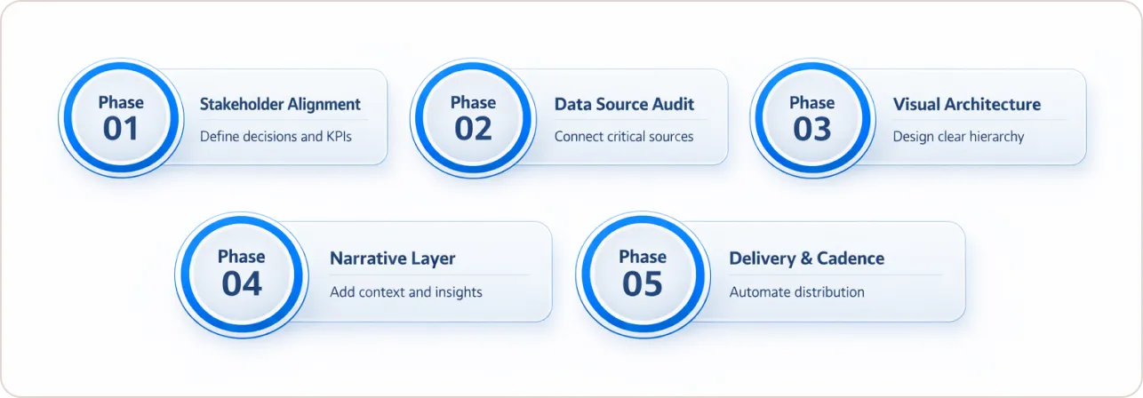
Phase 1: Stakeholder Alignment (Do Not Skip This)
Before opening any tool, interview the primary report consumer. The three questions to always ask: What decision do you make every month that this dashboard should inform? What number, if it dropped 20%, would cause you to call immediately? What do you wish you knew but currently have to ask for manually?
These answers define KPI selection better than any framework. They also create buy-in, because clients helped design the dashboard they are about to receive. This is also the phase where referencing how top agencies use data to win more clients can sharpen the conversation.
Phase 2: Data Source Audit
Connect only the sources that feed your chosen KPIs. For most clients, this means GA4, Google Ads, or Meta Ads, and a CRM. The Ultimate Website Dashboard combines GA4, Google Ads, and Search Console in one view, eliminating the tab-switching problem that derails meeting flow.
Phase 3: Visual Architecture
Apply the visual hierarchy principle: critical numbers at the top left, supporting context below, trend lines at the bottom. Nielsen Norman Group’s eye-tracking research confirms that users spend 80% of their digital attention on the top half of a display before scrolling. Your primary metric belongs in that real estate. Use scorecards for headline KPIs, line charts for trends, and bar charts for comparisons. Avoid pie charts for anything with more than four categories.
For practical visual inspiration, the guide on why marketing dashboards look unprofessional covers five common design mistakes that undermine credibility even when the data is solid.
Phase 4: Narrative Layer
A metrics dashboard without context is just a spreadsheet with borders. Add annotations where significant events occurred: budget changes, algorithm updates, campaign launches. Use the Situation-Action-Result (SAR) framework for any narrative summary section — here is what happened, here is what we did, here is the outcome.
For agencies managing SEO clients, the guide on SEO Analytics Reporting in 2025 goes deep on connecting organic data to revenue narratives, which is often the missing link in client reports.
Phase 5: Delivery and Cadence
The delivery method matters as much as the content. Dashboard login links work well for technically savvy clients who explore the data. Scheduled email PDFs work better for time-pressed CMOs who read reports on their phone. For a deeper automation strategy, the guide on automated marketing reports covers how to eliminate manual data pulls entirely and save 20+ hours per month.
Skip Phases 1–3 of the build process entirely. The stakeholder alignment, data source architecture, and visual hierarchy decisions above are already baked into BeastMetrics templates. Connect your data and go straight to the narrative layer. See the Ultimate Website Dashboard
What Are Common Metrics Dashboard Mistakes to Avoid?
In auditing agency KPI dashboards, five mistakes appear consistently.
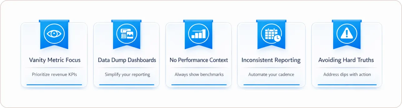
Reporting on vanity metrics. Total impressions and raw follower counts look impressive, but do not connect to business outcomes. Replace them with engagement rate by reach and conversion attribution from social channels.
Data dumps disguised as dashboards. Forty metrics across twelve tabs is not comprehensive reporting — it is deferred thinking. The agency’s job is to synthesize, not just aggregate.
No baseline or benchmark. A 3.2% conversion rate means nothing without context. Show the prior period, the industry average, and the target. Data without a benchmark is a number, not an insight.
Inconsistent reporting cadence. Sending reports randomly or only when results are good destroys trust faster than a bad month ever could. Automate delivery and stick to the schedule regardless of performance.
Avoiding difficult conversations with data. When results dip, present them directly, provide external context (rising CPCs, seasonality, algorithm shifts), and pivot immediately to corrective action. The Sandwich Approach: open with a positive trend, present the challenge with context, close with the fix.
What Are Real-World Metrics Dashboard Examples?
The best way to understand a great metrics dashboard is to study examples built for specific use cases.
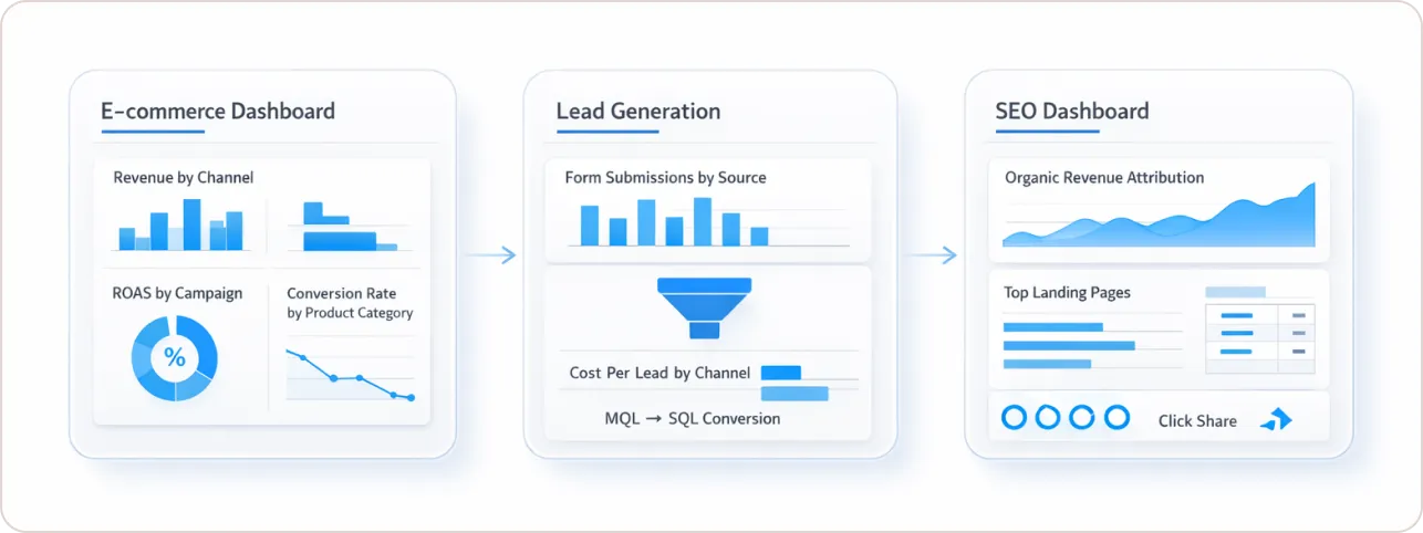
E-commerce dashboard: Should surface revenue by channel, ROAS by campaign, conversion rate by product category, and cart abandonment rate. The GA4 Ecommerce Looker Studio Template is a practical starting point, with KPIs pre-selected by marketers who manage high-volume online stores.
Lead generation dashboard: Prioritizes form submissions by source, cost per lead by channel, and MQL-to-SQL conversion rate. The GA4 Non-Ecommerce Template is designed around this exact use case.
SEO dashboard: Surfaces organic revenue attribution, conversion rate by landing page, click share from Google Search Console, and Core Web Vitals scores. The Google Search Console Template layers keyword-level data alongside traffic and engagement metrics in one view.
Conclusion: Build Dashboards That Make Clients Stay
The shift from raw data provision to decision intelligence is the defining competitive advantage in U.S. agency marketing right now. A great metrics dashboard does not just show what happened. It tells clients what to do next and makes them feel confident that their agency understands their business deeply.
Start with the decision. Work backward to the KPI. Build the visual layer. Add the narrative. Automate the delivery. That is the complete loop.
The fastest way to implement this without starting from scratch is to use professionally designed templates built by marketers who have already done the KPI dashboard architecture work. See our shortlist of Looker Studio templates for marketers.