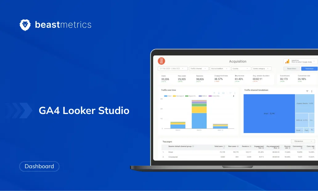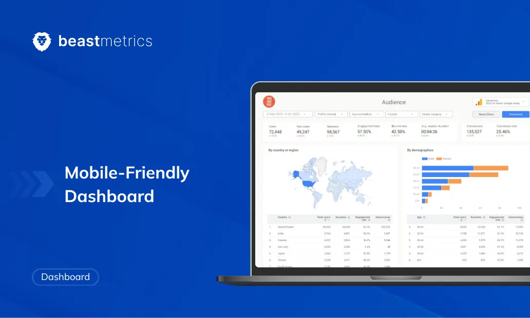
TL;DR
- You no longer need two separate report files. Looker Studio’s native responsive layout handles desktop and mobile from a single file.
- The layout runs on a 12-column fluid grid. Components spanning 3 or more columns auto-expand to full width on mobile. Components at 1 to 2 columns stack at half-width.
- Blending GA4 and Google Search Console data requires regex URL normalization before the join key matches correctly on any screen.
- Geo maps, pivot tables, and wide tables with more than 3 columns break on small viewports. Replace them with scorecards and compact flat tables.
- After reading this, you can ship a production-ready responsive KPI dashboard with GA4 data, section-level filter isolation, and mobile preview testing in one build session.
Quick Answer
A mobile-friendly dashboard in Looker Studio is a responsive report built on a fluid 12-column grid that automatically reflows, scales, and repositions components based on the viewer’s screen size, eliminating the need for separate desktop and mobile report files.
“This looks broken on my phone.”
That is the single most common piece of feedback I get after sharing a Looker Studio dashboard. I have heard it from CMOs, sales directors, and operations leads across e-commerce, SaaS, and media. For years, there was no clean fix. Looker Studio ran on an absolute-pixel canvas, and a report designed for a 1280px monitor was genuinely unreadable on a 390px phone screen.
That changed in June 2025 when Looker Studio released responsive dashboards. This is not a visual refresh. It is a structural rebuild of how dashboards are constructed (powered by a 12-column grid). This guide covers the full build process: the grid math, GA4 setup step by step, data blending with Google Search Console, and the chart types that will silently break your layout if you do not plan for them upfront.
What Is a Responsive Report in Looker Studio, and Why Does It Replace the Old Workaround?
A responsive report is a Looker Studio layout mode where every component sits inside a full-width horizontal section rather than on a fixed-pixel canvas. The layout engine divides each section into a 12-column fluid grid and scales every component as a percentage of available screen width, not a hard pixel value.
Before this feature existed, the industry workaround was a “skinny page”: a duplicate report with a canvas manually narrowed to around 414px, with every component stacked vertically by hand. That meant maintaining two separate files, two filter configurations, and two update cycles. At any reporting scale, it was unsustainable.
> Note: Looker vs Looker Studio. Looker is Google Cloud’s enterprise BI platform for large-scale data modeling, used by engineering teams. Looker Studio is a separate, free Google product built for self-service dashboarding. The two share a name but serve different audiences and run on different engines. If you want the full breakdown of where each tool fits, read Looker vs Looker Studio: Key Differences Explained. This guide covers Looker Studio exclusively.
According to Google’s official Looker Studio documentation on responsive reports, a responsive report “scales well across many different screen sizes” and is specifically recommended when users “regularly view the report on a tablet or other mobile device.” The feature creates a new report type from the Create menu, separate from the legacy freeform format.
How Does the 12-Column Grid System Work in Practice?
The 12-column grid converts column span choices into percentage-based widths automatically. You set the span number in the component Properties panel during editing, and Looker Studio handles the math:
Component width = (Column span / 12) x 100%
A scorecard set to 3 columns occupies exactly 25% of the section width. Four of those scorecards side by side fill the full 12-column row. A time series chart set to 12 columns stretches edge to edge on every screen, which is the correct setup for any trend line you want readable without zooming.
Section height is not fixed. It calculates dynamically based on the tallest column in that section. If you place a tall table next to two short scorecards, the section expands to accommodate the table without cropping anything below it.
What happens at the 776px breakpoint?
At viewports wider than 776px, the full 12-column desktop grid is active. When the viewport drops below 776px, the grid switches to a 2-column mobile layout. Components spanning 1 or 2 columns take up half the screen. Any component spanning 3 or more columns automatically expands to full screen width.
The practical rule to remember before you start building: anything you want side by side on desktop but stacked on mobile should span 3 or more columns. Anything that should stay half-width on mobile should stay at 1 or 2 columns. Getting this right upfront is the difference between a layout that reflows cleanly and one that creates random half-width gaps on a phone screen.
How Do I Build a Mobile-Friendly Dashboard in Looker Studio Step by Step?
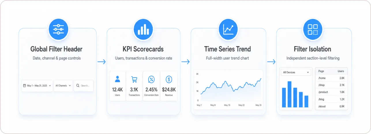
Building a responsive GA4 dashboard requires creating four sections in sequence. Each section is a separate container with its own grid, its own height behavior, and optionally its own filter scope.
Step 1: Create a new responsive report and connect GA4
Sign into Looker Studio and click Create, then Report. On the report type selection screen, choose Responsive report, not the default Freeform option. Connect the Google Analytics connector and authenticate your GA4 property. The interface looks identical to freeform mode, but the canvas now shows a 12-column grid overlay whenever you drag a component.
You cannot convert an existing freeform report to responsive through the UI. To migrate, copy all components from the freeform file, open a new responsive report, and paste them in. Do this section by section rather than copying everything at once. Formatting will shift, and doing it in sections lets you correct placement before you move to the next.
Step 2: Find the column span control
Select any component after placing it. In the right-hand Properties panel, look for the Layout section. This is where the column span slider appears. Most guides skip this step entirely, and most first-time builders spend 15 minutes looking for it. The slider only appears in responsive mode. It is not visible in freeform reports.
Step 3: Build Section 1, the global filter header
The default top section is your global header. Add a Date range control, a Drop-down list for “First user default channel group”, and an Input box for “Page path”. Set each control to 4 columns so three controls span the full 12-column row without wrapping on tablet viewports. These controls apply to all sections by default unless you override that behavior in individual sections.
Step 4: Build Section 2, the KPI scorecards
Hover over the bottom edge of the header section until a plus icon appears, then click it to create a new section. Add a scorecard for Total Users. To add the remaining KPIs within the same section without triggering new section breaks, duplicate this scorecard by right-clicking and dragging the copy horizontally. Configure four scorecards: Total Users, New Users, Transactions, and Purchase Conversion Rate, each at 3 columns.
Pro tip: Always duplicate an existing scorecard and drag it horizontally rather than inserting a new scorecard from the Insert menu. Inserting from the menu often creates an unintended new section break, splitting your KPI row across two separate containers.
Step 5: Build Section 3, the time series trend
Create a third section and insert a Time Series chart. Set the dimension to Date and the metric to Total Users. Set the column span to 12. This ensures the trend line renders at full width on both desktop and mobile, readable without zooming on any screen size.
Step 6: Build Section 4 with filter isolation
Create a fourth section with a Horizontal Bar chart (users by Country), a Vertical Bar chart (users by Device Category), and a Table (traffic by Page Path). To isolate this section from the global controls: click the section container, open the Properties panel, go to the Setup tab, and uncheck “Apply filter controls to page.”
Filters placed in Section 4 now only affect charts within Section 4. This prevents analysts applying a granular page-level filter from inadvertently breaking the layout or metrics in the KPI sections above. It is one of the most useful configuration options in the platform and almost no guides cover it properly.
If you want a pre-built version of this layout without the manual setup, the Ultimate Website Dashboard template from BeastMetrics combines GA4 and GSC data in a single report with the section structure and KPI scorecards already configured.
How Do You Blend GA4 and Google Search Console Data Without Breaking Mobile Tables?
Blending GA4 and Google Search Console data is where most responsive dashboards quietly break. The issue has nothing to do with screen size. It is a URL format mismatch between the two sources. GSC records absolute URLs like https://example.com/blog/post. GA4 records relative page paths like /blog/post. When you blend these using raw fields as a join key, the match fails silently and your blended table shows empty rows on every device.
The fix is to create a calculated field in each data source before building the blend.
In your GSC data source, create a field called Normalized Landing Page:
REGEXP_REPLACE(Landing Page, “^https?://(www\.)?[^/]+”, “”)
In your GA4 data source, create a field called Normalized Page Path to strip query strings:
REGEXP_REPLACE(Page Path, “\?.*”, “”)
Use these two normalized fields as the join key in your blended data source. The table will match correctly and display cleanly on mobile. Keep the blended table to a maximum of 3 visible columns. Tables wider than 3 columns lose legibility below 776px and force horizontal scrolling, which most mobile users abandon immediately.
One practical limit to know: the native GSC connector in Looker Studio exports a maximum of 1,000 rows. For enterprise teams needing full-scale search data, the standard approach is to export GSC data to Google BigQuery via the Search Console BigQuery export, then connect BigQuery to Looker Studio directly. For most teams managing fewer than 1,000 landing pages, the native connector is sufficient.
The Google Search Console Template from BeastMetrics already handles the blending configuration, with keyword rankings, CTR, and page-level performance laid out across sections that reflow cleanly on mobile.
Responsive Layout vs. Freeform Layout: Which One Should You Use?
| Feature | Responsive Layout | Freeform Layout |
|---|---|---|
| Auto-reflows on mobile | Yes | No |
| 12-column fluid grid | Yes | No (absolute px) |
| Single file for all devices | Yes | No, requires duplicate |
| Modern Charts support | Yes | Partial |
| Section-level filter isolation | Yes | No |
| Built-in mobile preview toggle | Yes (Phone/Tablet/Large Screen) | No |
| Overlapping components | No | Yes |
| Decorative lines and shapes | No | Yes |
| Persistent report-level headers | No | Yes |
| Convert from freeform layout | Manual copy required | Native |
The mobile preview toggle is worth calling out specifically. In responsive report edit mode, click the downward arrow next to the View button and select Phone, Tablet, or Large Screen to see exactly how your layout reflows at each breakpoint. Use this before every publish. It takes 15 seconds and prevents the most common stakeholder complaints.
What Chart Types Break on Mobile and What Should You Use Instead?
Not every chart type scales cleanly to a narrow viewport. According to Google’s responsive report documentation, the rendering engine converts every component to full available width when the viewport drops below the mobile threshold. This is correct behavior for well-planned charts, but it exposes weaknesses in anything built for wide desktop displays.
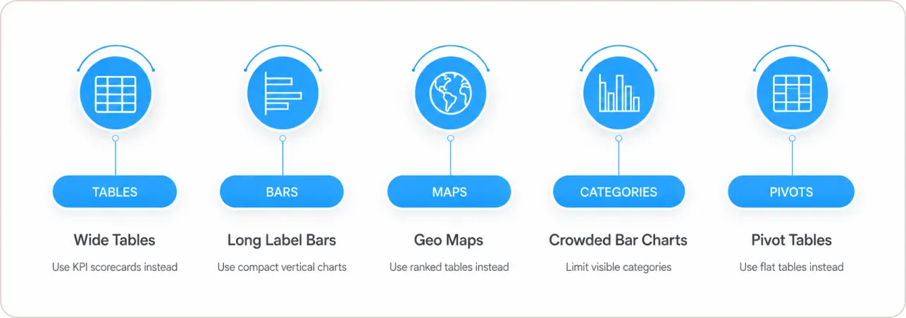
Tables with more than 3 columns overflow the container or collapse to unreadable widths. Limit mobile tables to 2 or 3 key columns. Use a Scorecard group for any summary values that do not need row-level detail.
Horizontal bar charts with long dimension labels get left-axis labels truncated on narrow screens. Switch to a compact vertical bar chart with shortened labels, or use a ranked flat table sorted by the relevant metric.
Geo maps fail to render usably at small sizes and offer no practical interactivity on touch screens. Replace them with a ranked Table or Bar chart showing top countries or regions.
Vertical bar charts with 10 or more categories crowd together to the point of illegibility. Limit visible bars to 7 or fewer using a filter control, or aggregate your dimension to fewer groups at the data source level.
Pivot tables are essentially unusable below 480px. The combination of row and column headers eliminates any readable space. Replace with a flat table sorted by a single dimension, with a filter control for slicing.
As Edward R. Tufte wrote in The Visual Display of Quantitative Information (1983, p. 51): “Graphical excellence is that which gives to the viewer the greatest number of ideas in the shortest time with the least ink in the smallest space.” That principle is not a design preference on mobile. It is a hard constraint imposed by the screen itself.
If you want to see what a KPI-focused, mobile-optimized metrics layout looks like in practice before building your own, the guide on metrics dashboards for marketing agencies covers KPI selection by channel and how to structure dashboards so every section earns its place.
What Are the Hard Limits of Responsive Mode and How Do You Work Around Them?
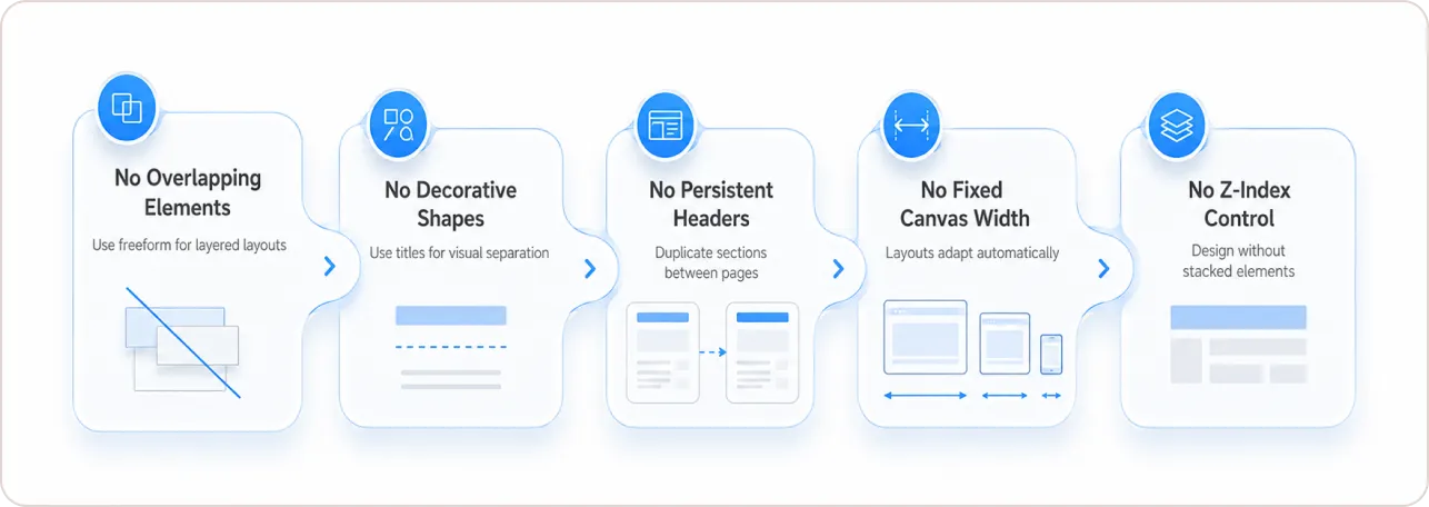
Responsive reports are not a complete replacement for every use case. These restrictions are real and non-negotiable.
No overlapping components. Send to Front and Send to Back are disabled. Any design relying on layered elements requires a freeform layout.
No decorative lines, arrows, or custom shapes. Drawing tools for visual dividers are unsupported. Use chart title descriptions for section labeling instead.
No persistent report-level components. A branded header placed at the report level in freeform mode appears on every page automatically. In responsive mode, you must rebuild Section 1 of each new page individually. The workaround is to build your header once, then copy that section to new pages as you add them.
No custom canvas dimensions. The canvas fills available screen width automatically. You cannot lock it to a fixed pixel width.
No Z-index control. Element ordering (bring to front, send to back) is disabled entirely. Plan layouts without any stacking requirements.
For teams that need reports that handle both client-facing mobile access and branded desktop presentations, a practical split is to use responsive reports for stakeholder KPI dashboards shared via link or email, and freeform reports for agency-produced PDF exports that require pixel-precise layout. The client reporting dashboard guide covers how agencies structure both types within the same reporting workflow.
Why This Is a Business Priority, Not a Design Preference
According to StatCounter data published by Statista, mobile devices accounted for 62.54% of all global website traffic in Q2 2025. A separate Statista dataset based on DataReportal figures shows that over 96% of the global digital population used a mobile device to connect to the internet as of mid-2024.
When your stakeholders are majority mobile by default, a dashboard that only works on desktop is not a mobile-unfriendly dashboard. It is a broken dashboard. The build effort for a responsive Looker Studio report is equivalent to building a freeform report. The maintenance effort is half the work, because you are maintaining one file instead of two.
According to the Gartner 2024 Data and Analytics Trends report, organizations that fail to make analytics accessible across consumption contexts, including mobile, risk falling behind in decision-making speed. Mobile-first data access is now treated as a standard infrastructure expectation in enterprise analytics, not an optional enhancement.
The Bottom Line: One File, Every Screen, No Excuses
Every report still running on an absolute-pixel canvas is actively failing anyone who opens it on a phone. Based on current traffic data, that is the majority of your audience by volume.
The decisions that matter are straightforward. Use 3-column scorecards for the KPI row. Set time series charts to 12 columns. Apply section-level filter isolation for breakout analysis. Normalize your URLs with REGEXP_REPLACE before blending GA4 and GSC. Replace any chart that needs more than 3 columns of data on mobile with a simpler alternative.
Design mobile first. Test at 390px using the built-in preview. Then let the desktop layout scale up from there. That one habit eliminates the most common source of stakeholder dashboard complaints.
If you want the responsive layout pre-built so you can skip straight to the data, the BeastMetrics template library has GA4, GSC, Google Ads, and Meta Ads responsive templates built to these specifications, deployed in under 15 minutes.