Key Highlights:
- Clutter kills credibility—focus beats overwhelming data dumps
- Consistent colors and fonts signal professional attention to detail
- Context transforms raw numbers into actionable business insights
- Mobile-responsive design shows you respect stakeholder time
- Professional templates eliminate design guesswork entirely
Introduction:
Your data’s solid—so why does your dashboard still look amateur?
I’ve been in that boardroom. Sweaty palms, confident data, confused faces staring at my “comprehensive” dashboard. The metrics were accurate, the insights were there, but something was off. My client’s furrowed brow said it all: this looks… amateur.
Here’s the uncomfortable truth: 90% of business intelligence dashboards go unused after 6 months—not because the data is wrong, but because users don’t trust or understand them. When your marketing dashboard looks unprofessional, it doesn’t matter how solid your numbers are. Decision-makers tune out, budgets get questioned, and your credibility takes a hit.
The good news? Most dashboard design mistakes are easily fixable once you know what you’re looking at. In this guide, I’ll show you the exact mistakes making your marketing dashboards look unprofessional—and the specific fixes that work.
What Makes a Marketing Dashboard Look Unprofessional
Before we dive into solutions, let’s be honest about what unprofessional actually looks like in practice.
Unprofessional marketing dashboards typically share these telltale signs:
- No visual hierarchy – everything screams for attention, so nothing gets it
- Clashing default colors – that out-of-the-box template aesthetic
- Context-free numbers – is 2,547 sessions good? Who knows!
- Misaligned elements – widgets scattered randomly across the page
- Information overload – 47 metrics when you really need 7
Why does this matter? Because presentation shapes perception. When your CMO sees a messy dashboard, they don’t think “messy dashboard”—they think “messy thinking.” A cluttered report suggests unclear priorities. Inconsistent styling implies careless work.
Your data doesn’t speak for itself. How you present it determines whether stakeholders lean in with interest or tune out with doubt.
The 5 Fatal Dashboard Design Mistakes (And How to Fix Them)
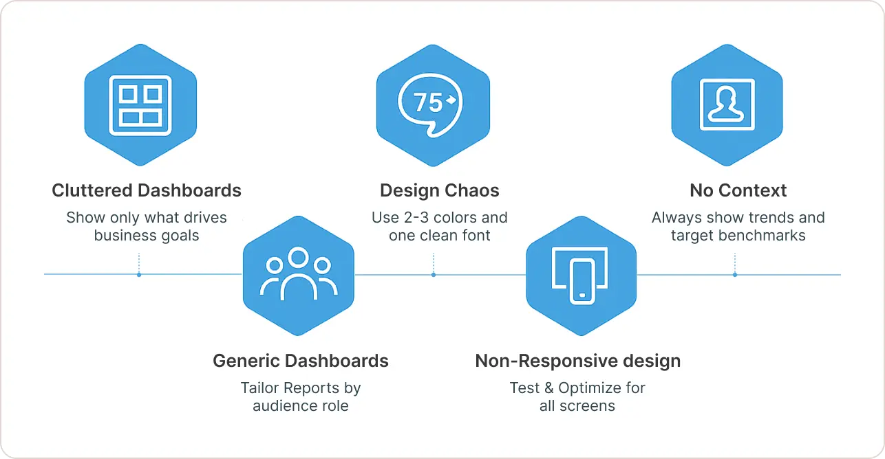
1. Too Much Clutter, Not Enough Focus
The Problem: You’re trying to show everything—last month’s 50 KPIs crammed onto one screen because surely someone might need “pages per session by device on Tuesdays.”
Information overload is the fastest way to look amateur. When every metric gets equal real estate, you’re telling your audience: “I don’t know what’s important, so here’s everything—you figure it out.”
The Fix:
Edit ruthlessly. Start with your business goals, not your data sources. If you’re focused on lead generation, your digital marketing dashboard should scream “leads”—not bounce rate, not seventeen social media vanity metrics.
Apply the five-second rule. Can a viewer grasp your main insight in five seconds? If not, cut until they can.
Create visual hierarchy through size and position. Your most critical KPI should be largest and positioned top-left. Secondary metrics get smaller real estate. One page, one story.
2. Visual Design Chaos (Colors, Fonts, and Style Mistakes)
The Problem: Your dashboard uses six different fonts, eight bright colors, and looks like a ransom note. Design experts found that using more than 2-3 colors creates “a complete eyesore” that “hinders effective data visualization.”
The Fix:
Apply CRAP principles: Contrast ensures readability—dark text on light backgrounds. Repetition creates consistency—same fonts, same chart styles throughout. Alignment looks professional—everything snaps to a grid. Proximity groups related items visually.
Choose a restrained color palette. Use your brand’s primary color for key metrics. Pick one neutral (gray/black) for most text. Add one accent color maximum. That’s it. Three colors, used consistently, beat twelve colors used randomly.
Stick to professional fonts. One clean sans-serif font (Roboto, Open Sans, Arial) at different weights creates all the hierarchy you need.
Pro tip: Most dashboard tools let you set a global theme. Configure this once and every element inherits professional styling automatically.
3. Numbers Without Context (The “So What?” Problem)
The Problem: Your SEO and marketing dashboard shows “Conversion Rate: 2.4%” and… that’s it. No comparison to last month. No benchmark against your target. Just a naked number floating in space.
Context transforms data into insight. Without it, you’re forcing viewers to guess whether results are good or bad.
The Fix:
Always provide comparison points. For every key metric, show:
- Period-over-period: “Traffic up 23% vs. last month”
- Vs. target: “85% of quarterly goal (target: 500 leads)”
- Year-over-year: “Best December performance in 3 years”
Use visual shortcuts like trend arrows (↑ 15%), sparklines, or color coding (green for above target, red for below).
Add narrative captions. A text box summarizing the story—”🚀 Record month: Paid search drove 40% more qualified leads while CPA dropped 12%”—guides viewers to the insight.
Explain anomalies inline. If traffic dropped 30% on a specific day, note it: “Oct 15: Site outage.” This prevents panic and shows you’re monitoring actively.
4. One-Size-Fits-All Syndrome
The Problem: You’re showing the same dashboard to your CEO (who wants ROI at a glance), your marketing manager (who needs channel performance), and your PPC specialist (who lives in campaign data). Nobody’s happy.
Generic dashboards feel unprofessional because they signal you haven’t thought about your audience.
The Fix:
Design for specific audiences. Create role-based views:
- Executive dashboard: 5-7 KPIs max, all tied to revenue/business goals
- Manager dashboard: Channel performance, budget pacing, conversion funnels
- Specialist dashboard: Campaign details, optimization opportunities
Use filters and customization. Add prominent filters (date range, channel selector) so viewers can self-serve their slice of data.
Speak their language. Client-facing dashboards should avoid internal jargon. A content marketing dashboard for your team can use “MoM CTR” but your client version should say “month-over-month click rate.”
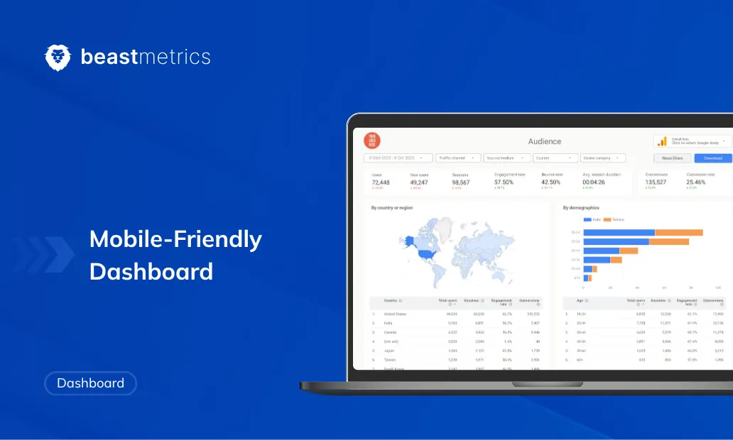
5. Not Mobile-Responsive
The Problem: Your dashboard looks perfect on your 27-inch monitor but turns into an illegible mess on your boss’s tablet.
In 2025, executives check reports on their phones between meetings. If your kpi marketing dashboard isn’t accessible everywhere, you’re essentially saying “this isn’t important enough to optimize.”
The Fix:
Test across devices before launching. Check how your report renders on laptop, tablet, and phone screens. If elements break or become unreadable, redesign.
Simplify for mobile. Your desktop version might show 12 metrics; your mobile version should show 4-6 critical ones. Prioritize ruthlessly.
Provide PDF exports. Ensure your dashboard exports cleanly—proper page breaks, readable font sizes, no cut-off charts.
The Professional Dashboard Checklist
Here’s your implementation roadmap:
1. Start with strategy, not data. Define your dashboard’s purpose in one sentence. “Show CMO whether paid campaigns are hitting Q4 lead targets” is clear. “Track all marketing” is not.
2. Choose 5-7 core KPIs. These are the metrics that directly answer your purpose statement. Everything else gets cut.
3. Apply consistent visual styling. Set your theme once. Use your brand palette. Align everything to a grid. Add white space between sections. The same rules apply to white label SEO reports you send under your agency’s brand.
4. Add context to every number. Show previous period, target, or benchmark for each KPI. Use trend indicators. Include explanatory captions.
5. Design for your audience. Tailor detail level, terminology, and metrics to who’s viewing. Create separate views if serving multiple stakeholders.
6. Test across devices. Check desktop, tablet, and mobile rendering. Ensure exports look professional.
The Template Shortcut: Why Building From Scratch Is Overrated
Here’s what nobody tells you: building your own dashboard takes forever, and unless you’re a designer, it’ll probably still look mediocre.
I’ve spent countless hours tweaking alignment and testing color combinations. Then I’d see another marketer’s social media marketing dashboard using a professional template and realize they got to “polished” in 15 minutes while I’d invested 15 hours.
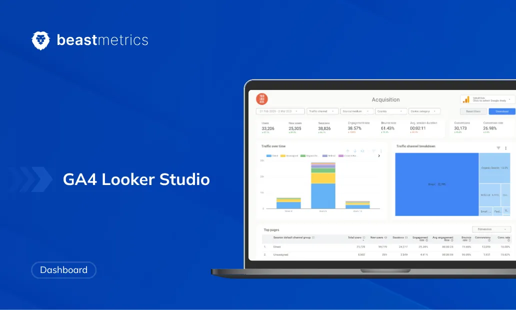
Professional templates solve the design problem upfront. They come pre-built with proper spacing, cohesive color schemes, appropriate chart selections, and logical layouts. You skip directly to the valuable part—analyzing your data. These are the Looker Studio templates we would start with.
This is exactly why Beast Metrics exists. Every template is built by marketers who’ve made (and fixed) these mistakes hundreds of times. The Google Ads template already has your key metrics highlighted, period comparisons built in, and device breakdowns properly visualized.
You’re not “cheating” by using a template—you’re being smart with your time. The best ones are fully customizable, so you still add your branding and adjust metrics to your specific needs. You’re just starting from a professional foundation instead of a blank canvas.
Conclusion: From Amateur Hour to Agency Quality
The difference between an unprofessional dashboard and a polished one isn’t mysterious—it’s methodical. Cut the clutter. Apply consistent visual design. Add context everywhere. Tailor to your audience. Test on mobile.
Most importantly, remember that your dashboard is a communication tool, not just a data dump. Every design choice either builds or erodes your credibility. Clean layouts signal clear thinking. Consistent styling implies careful work. Contextual insights prove you’ve done real analysis.
The marketers who get promoted, win client renewals, and actually influence decisions aren’t necessarily analyzing better data—they’re presenting it better. They understand that a dashboard that looks professional is trusted, and a trusted dashboard gets used.
Start with one dashboard—apply these fixes, or grab a marketing dashboard template that does it for you—and watch how stakeholder confidence shifts when they see clarity instead of confusion.
Your data deserves better than amateur presentation. Give it the polished, professional showcase it needs to drive real decisions.