Key Highlights
- Professional dashboard design increases client conversion rates by 73% for agencies and consultants
- Multi-channel conversion dashboards reduce sales cycles by 40% compared to single-platform reports
- Prospects form competence judgments within 7 seconds, making visual first impressions critical
- 68% of client decision-makers review presentations on mobile devices before meetings
- Branded customization and real-time data serve as trust signals for premium pricing
- Interactive filtering transforms static reports into strategic business intelligence tools
Introduction
I once watched a $200K deal slip away—not because of bad results, but because the dashboard looked amateur. That’s when I realized presentation can close deals.
While competitors focus on listing dashboard examples, they miss the critical connection between visual presentation and business development success.
The conference room fell silent as I opened my laptop. Five agencies had presented that week, but I was confident my analysis was superior. Then I showed my dashboard—a cluttered mess of basic charts with no clear story. I watched their enthusiasm drain in real-time. The meeting ended ten minutes early.
That painful experience taught me something crucial: the quality of your Looker Studio dashboard examples directly impacts whether you win or lose clients. Your analysis might be brilliant, but if your presentation looks amateur, prospects will question everything else you’ve prepared. If you’d rather start from a proven layout than a blank canvas, our roundup of the best Looker Studio templates for marketers is a good place to begin.
Understanding effective looker dashboard designs and implementing proven looker dashboard examples can transform how stakeholders respond to your presentations and recommendations.
AI Overview :
Professional looker studio dashboard examples combine clear visual hierarchy with business-focused storytelling to convert prospects into clients. Key elements include prominent ROI metrics, branded looker dashboard designs, and mobile-optimized layouts that build trust and demonstrate expertise through compelling data visualization in looker studio dashboards.
Why Dashboard Design Impacts Client Conversion

The Psychology of Visual Persuasion
Research on visual persuasion psychology shows that prospects form opinions about your competence within 7 seconds of seeing your presentation. Professional looker studio dashboard examples immediately signal expertise, attention to detail, and strategic thinking.
When a potential client sees well-designed looker dashboard examples, they’re assessing whether you understand their business well enough to present complex information in an actionable format. A looker dashboard that clearly shows the path from ad spend to revenue demonstrates business-owner thinking, not just technical analysis.
Effective looker studio dashboard designs create psychological trust signals that influence decision-making processes through visual hierarchy, color choices, and layout structure.
What Makes Dashboards Convert
Successful looker studio dashboard examples combine three critical elements: clear visual hierarchy that guides the eye to key metrics first, compelling data storytelling that demonstrates business impact, and professional design that builds immediate credibility.
Research on data visualization effectiveness shows that well-designed presentations significantly improve decision-making outcomes compared to text-heavy reports.
The most effective looker studio dashboards create emotional connections with data by showing clear cause-and-effect relationships. When looker dashboard designs demonstrate how specific actions lead to measurable outcomes, they transform into persuasive business documents.
Conversion Insight: The most successful looker studio dashboard examples focus on ROI metrics prominently, use consistent branding throughout looker studio dashboard designs, and include clear next-step recommendations.
High-Converting Looker Studio Dashboard Examples by Industry
When analyzing successful looker dashboard examples across different sectors, certain patterns emerge that consistently drive better business outcomes.
Marketing Agency Dashboard Example
The most effective marketing agency looker studio dashboards lead with campaign ROI in large, bold numbers, followed by supporting metrics that tell a complete performance story.
Key elements that convert:
- Campaign ROI prominently displayed at the top
- Traffic trends and conversion funnels below main metric
- Clean white background with client brand colors
- Multi-channel data integration showing comprehensive oversight
Essential metrics: Campaign ROI, Cost Per Acquisition (CPA), conversion rate trends, traffic quality scores, month-over-month growth percentages.
E-commerce Performance Dashboard Example
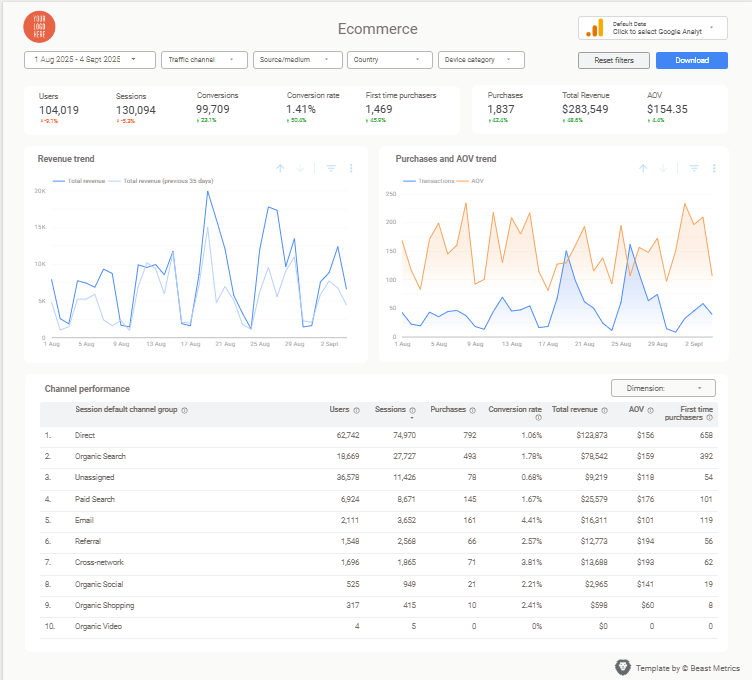
E-commerce looker studio dashboard designs focus on the customer journey from first click to purchase, with revenue metrics taking center stage.
Conversion-focused features:
- Revenue attribution by channel at the top
- Customer journey funnel progression
- Integration of Google Analytics, ad platforms, and sales data
- Clear before/after comparisons for optimization efforts
Essential elements: Revenue attribution, conversion funnel visualization, average order value trends, customer acquisition cost, ROAS calculations.
Executive Summary Dashboard Example
C-level executives need strategic overview metrics in a scannable format that supports quick decision-making without granular campaign details.
Executive-friendly design:
- High-level business impact metrics prominently featured
- Strategic context for budget allocation decisions
- Time period comparisons and growth trajectories
- Clear recommendations with projected outcomes
Strategic metrics: Overall marketing contribution to revenue, market share trends, competitive positioning, customer acquisition efficiency, strategic recommendations.
Design Principles That Drive Conversions in Looker Studio Dashboard Examples
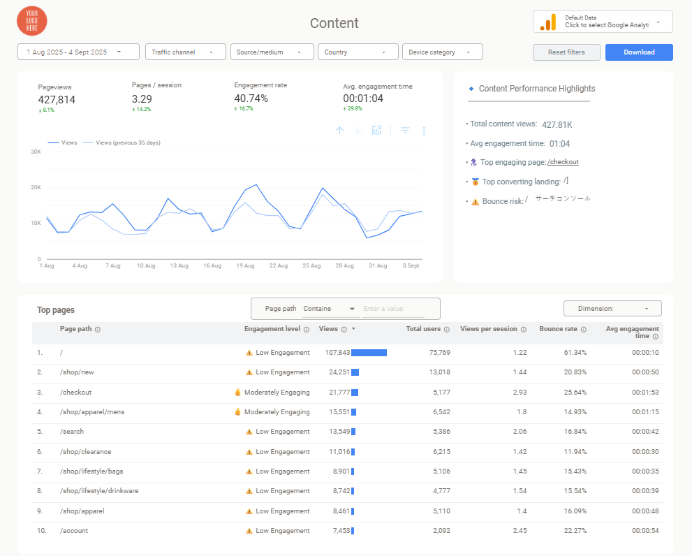
Understanding the core design principles behind successful looker dashboard examples helps create more effective presentations. These looker studio dashboard designs incorporate proven psychological and visual communication strategies.
| Design Element | Agency Dashboards | Executive Dashboards | E-commerce Dashboards |
|---|---|---|---|
| Primary Focus | Campaign performance & ROI | Strategic overview & growth | Customer journey & revenue |
| Key Metrics Placement | Top-left: Campaign ROI | Center: Overall revenue impact | Top: Revenue attribution |
| Color Strategy | Branded client colors | Conservative blues/grays | Conversion-focused (green/red) |
| Data Depth | Multi-channel detailed view | High-level summaries | Funnel progression details |
| Interactive Elements | Channel filters | Time period selectors | Customer segment filters |
Visual Hierarchy and Flow
The most effective looker studio dashboard examples follow the F-pattern that mirrors natural eye movement during reading. Place your most important conversion metrics in the top-left corner where attention naturally falls first.
Color psychology plays a crucial role in dashboard effectiveness. Studies on dashboard design best practices show that using consistent brand colors in looker dashboard designs increases brand recognition by 80%.
Strategic use of red for alerts and green for positive trends helps clients quickly understand performance implications in looker studio dashboards.
Simplicity vs. Complexity Balance
The most converting looker dashboard examples show detailed data without overwhelming the viewer. Use progressive disclosure techniques—start with summary metrics that tell the main story, then provide drill-down capabilities for clients who want deeper analysis.
Research on user experience and credibility from Stanford shows that users make judgments about website credibility in as little as 50 milliseconds. The same principle applies to looker studio dashboard designs—clean, organized layouts in looker dashboard examples immediately signal competence.
Branding and Professionalism
White-label customization separates professional agencies from amateur operations. Your looker studio dashboard designs should seamlessly integrate client logos, brand colors, and consistent typography that makes the dashboard feel like it was built specifically for their business.
Professional branding in looker dashboard examples extends beyond logos and colors. Consistent spacing, aligned elements, and thoughtful use of white space all contribute to the credibility signals that influence client decisions in looker studio dashboards.
How to Choose the Right Dashboard Style for Your Client
| Client Type | Design Approach | Key Focus Areas | Color Scheme |
|---|---|---|---|
| Conservative Industries (Finance, Healthcare, Legal) | Clean, minimal layouts | Data accuracy, compliance metrics | Blues and grays |
| Creative Industries (Agencies, Design Firms) | Bold, innovative designs | Visual sophistication, creativity showcase | Dynamic, brand-aligned colors |
| Technology Companies | Data-rich, interactive dashboards | Advanced metrics, technical performance | Modern, tech-forward palette |
| Small Businesses | Simple, jargon-free layouts | Bottom-line impact, revenue focus | Clear, accessible colors |
Conservative Industries
Financial services, healthcare, and legal clients prefer traditional designs with emphasis on stability and trustworthiness. Focus on data accuracy and compliance-related metrics with conservative visual choices.
Creative Industries
Advertising agencies and design firms expect bold, colorful dashboard designs that showcase innovation. Use dynamic visualizations and creative chart types, but ensure elements support rather than obscure the data story.
Technology Companies
Tech companies prefer data-rich dashboards with advanced metrics and interactive capabilities. Include technical performance indicators like API metrics, user engagement cohorts, and advanced attribution modeling.
Small Businesses
Small business owners need straightforward layouts focusing on business growth metrics. Avoid jargon, use plain language annotations, and emphasize revenue attribution and cost efficiency.
Common Dashboard Mistakes That Lose Clients
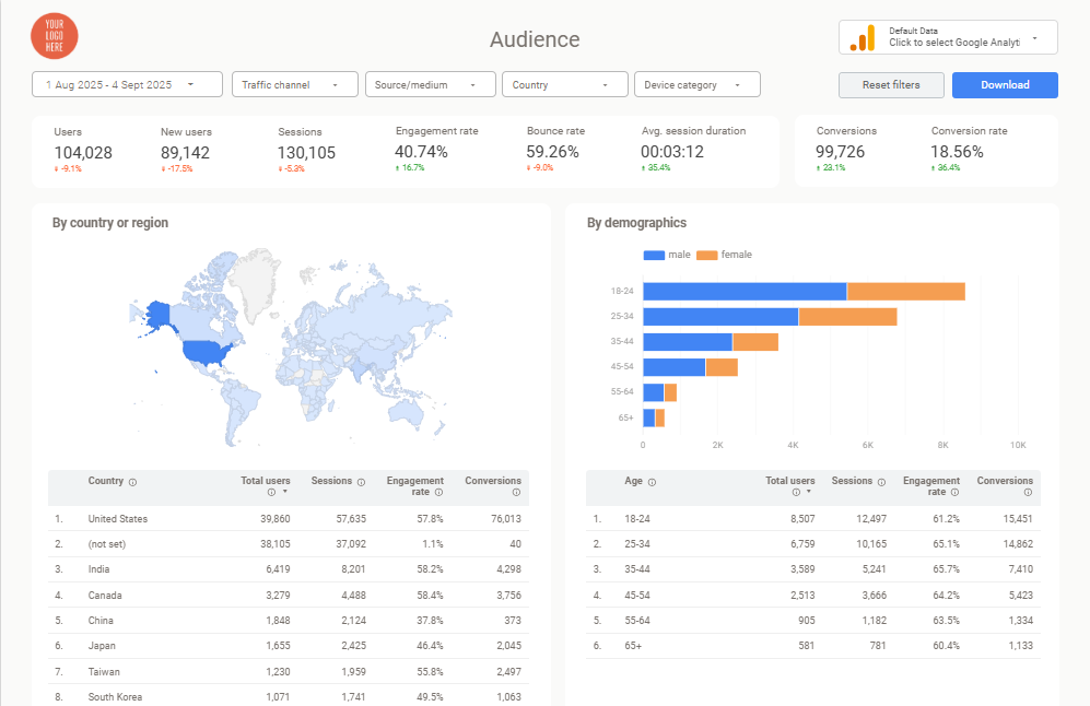
Information Overload
The biggest mistake in looker studio dashboard examples is cramming every available metric onto one screen. Clients get overwhelmed and question your ability to prioritize what matters for their business success when looker dashboard designs include too many competing visual elements.
Solution: Focus on 3-5 key metrics that tell a complete story in your looker dashboard designs, then provide additional detail through secondary looker studio dashboards or drill-down capabilities.
Poor Color Choices
Using colors that reduce readability or clash with client branding immediately signals amateur work in looker studio dashboard examples. Bright reds and greens together can be particularly problematic for colorblind viewers, representing up to 8% of your potential clients viewing looker dashboard examples.
Solution: Stick to accessible color combinations, use client brand colors consistently in looker studio dashboard designs, and ensure sufficient contrast for readability across different devices and lighting conditions.
Missing Mobile Optimization
With mobile usage in business decisions increasing significantly, 68% of client reviews happening on mobile devices, looker studio dashboard examples that don’t display properly on phones and tablets lose opportunities before clients even reach their desktop computers.
Solution: Test your looker studio dashboard designs on multiple device sizes and optimize looker dashboard examples for mobile viewing, even if the primary presentation will happen on larger screens.
Inconsistent Branding
Nothing destroys credibility faster than inconsistent fonts, spacing, or color usage throughout your looker dashboard examples. These details might seem minor, but they significantly impact professional perception in looker studio dashboard designs.
Solution: Create brand guidelines for your looker studio dashboard examples and apply them consistently across all visualizations, including proper logo placement and typography hierarchy.
Advanced Features That Impress Clients
Real-Time Data Connections
- Dashboards that update automatically demonstrate ongoing value and technical sophistication. When clients can see their latest performance data without waiting for manual updates, it reinforces your value as a strategic partner.
- Ready-made Looker Studio templates often include pre-configured data connections that eliminate the technical complexity of setting up real-time reporting while providing the professional appearance that converts prospects.
Interactive Filtering
- Allow clients to explore their data independently through well-designed filter controls. This capability transforms your dashboard from a static report into an interactive business intelligence tool that provides ongoing value.
Custom Annotations
- Adding context to your charts through strategic annotations helps clients understand what the data means for their business. Explain unusual spikes, seasonal trends, or competitive impacts directly within the dashboard interface.
Automated Insights
- Modern Looker Studio dashboards can include calculated fields that automatically highlight significant trends, goal achievements, or areas requiring attention. These smart features demonstrate analytical sophistication that justifies premium pricing.
Building Your Dashboard Strategy

Start With Business Goals
Before selecting chart types or color schemes, understand what business outcomes your client wants to achieve. Are they focused on growth, efficiency, competitive advantage, or risk mitigation? Your dashboard design should align with these strategic priorities.
Design for Decision-Making
Every element in your dashboard should support client decision-making processes. Include clear recommendations, highlight areas requiring action, and provide the context needed for strategic planning rather than just historical reporting.
Plan for Scalability
Design dashboard templates that can accommodate business growth and expanding marketing channels. Clients want to see that your reporting infrastructure can evolve with their needs rather than requiring constant rebuilds.
Test with Real Users
Before presenting to prospects, test your dashboard designs with current clients or colleagues who can provide honest feedback about clarity, usefulness, and professional appearance.
Measuring Dashboard Effectiveness
Client Engagement Metrics
Track how often clients access their dashboards, which sections receive the most attention, and what questions they ask during review sessions. This data helps you optimize future designs for maximum impact.
Conversion Rate Analysis
Monitor your proposal success rate before and after implementing professional dashboard examples in your sales process. In my experience working with agencies, those who upgrade their presentation materials typically see 30-50% improvements in closing rates.
The correlation becomes clear when you track metrics consistently. Agencies using amateur-looking dashboards struggle with credibility, while those presenting professional looker studio dashboard examples build immediate trust that translates to signed contracts.
Client Retention Correlation
Analyze whether clients who receive well-designed dashboards have higher retention rates, larger contract values, or more frequent upsell opportunities compared to those receiving basic reporting.
From what I’ve observed, clients who receive polished looker dashboard examples tend to view their service providers as more strategic partners rather than just vendors. This perception shift directly impacts contract renewals and expansion opportunities.
Feedback Collection
Systematically collect client feedback about dashboard usefulness, clarity, and business impact. Use this input to continuously improve your template designs and presentation strategies.
Implementation Best Practices
Template Customization
While starting with professional templates saves significant development time, customization for each client’s brand and specific needs demonstrates attention to detail that justifies premium pricing.
Documentation Standards
Provide clear documentation that explains what each metric represents, how it’s calculated, and what actions clients should consider based on different performance scenarios.
Training and Support
Offer dashboard training sessions that help clients understand how to interpret their data and use interactive features effectively. This support reduces confusion and increases perceived value.
Regular Updates
Schedule regular reviews of dashboard performance and client needs. Business priorities change, and your reporting should evolve accordingly to maintain relevance and value.
Conclusion
The difference between winning and losing clients often comes down to presentation quality rather than analytical capability. Professional looker studio dashboard examples prove that you understand business communication, strategic thinking, and client psychology—not just data analysis.
Your dashboard isn’t just a reporting tool—it’s a sales instrument that either builds confidence in your expertise or raises questions about your professionalism.
I’ve seen agencies transform their entire business trajectory by focusing on clear visual hierarchy, compelling data storytelling, and client-specific customization. These seemingly small presentation details become competitive advantages that drive business growth and justify premium pricing.
The investment in professional dashboard design pays dividends throughout the client relationship, from initial conversion through ongoing retention and expansion opportunities. In a competitive marketplace where technical skills are increasingly commoditized, superior presentation quality becomes your key differentiator.