Key Highlights
- Specialized dashboards answer specific questions faster than one overwhelming view
- Executive summaries deliver business health checks in under 30 seconds
- Product analysis reveals profit drivers hidden in revenue-only reports
- Funnel dashboards expose exact customer drop-off points for optimization
- Attribution tracking connects every marketing dollar to actual revenue outcomes
“Stop drowning in ecommerce data—start making decisions in seconds.”
Last month, a frustrated client messaged me at 11 PM: “Can you build us one dashboard that shows everything?”
I understood the appeal. One screen, all the answers.
So I spent the next week cramming revenue metrics, conversion funnels, customer behavior data, inventory levels, and marketing performance into a single ecommerce analytics dashboard. The result looked impressive—until they tried using it.
“Which number tells me if our Facebook ads are working?” they asked.
“Where do I see if we’re losing money on shipping?”
“Why is this so complicated?”
That’s when I realized: trying to answer every question with one ecommerce dashboard is like using a Swiss Army knife to build a house. You need the right tool for each job.
After rebuilding their reporting system with five specialized dashboards, each designed for specific scenarios and stakeholders, their decision-making speed doubled.
This guide shares those five essential types—the same frameworks successful online stores use to turn data into revenue-driving decisions across every major platform.
Why One Ecommerce Dashboard Fails Everyone
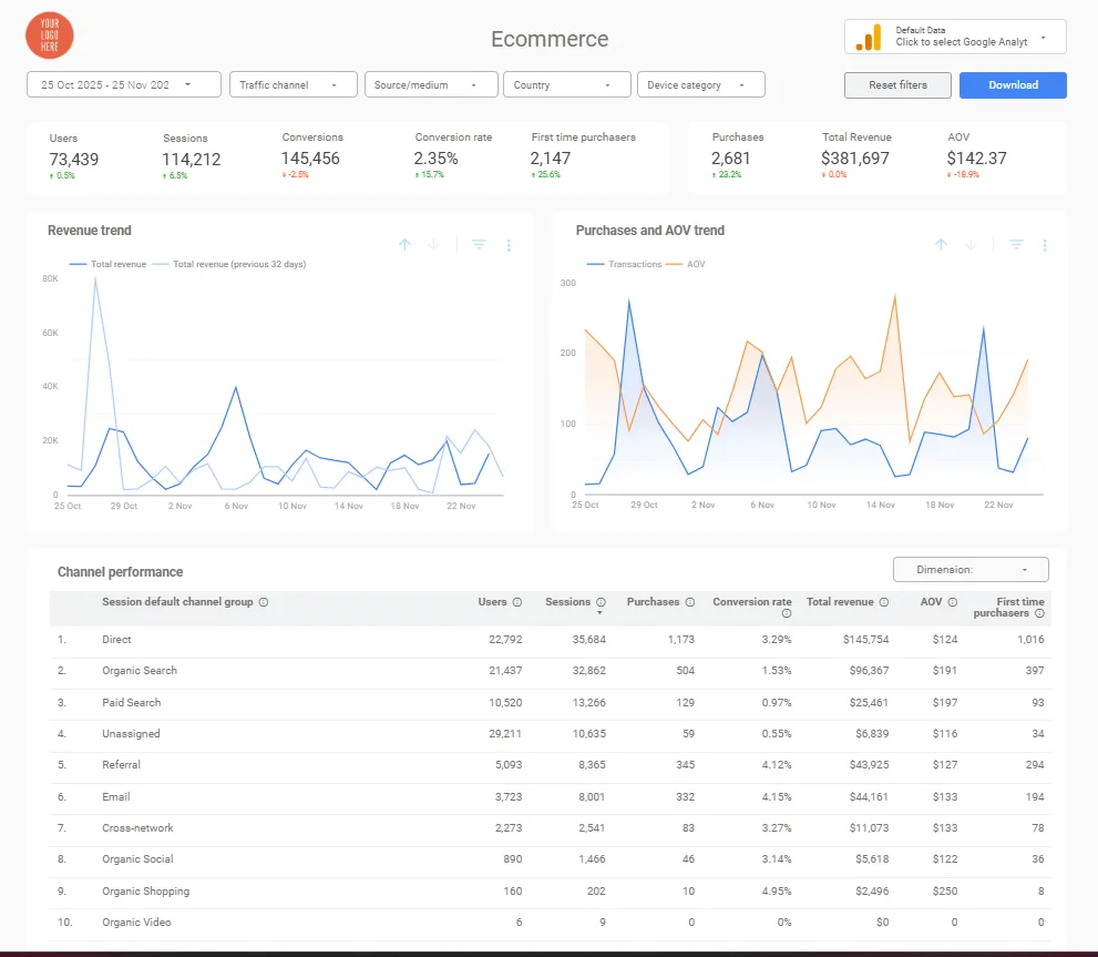
Different Teams Need Different Answers
Your CEO doesn’t need SKU-level inventory turnover rates at 8 AM. Your warehouse manager doesn’t care about social media conversion attribution. Your marketing team shouldn’t waste time filtering operational metrics to find campaign performance.
According to research on data-driven organizations, companies providing role-specific analytics tools see 23% faster decision-making than those using one-size-fits-all dashboards.
What each team actually needs from their ecommerce analytics dashboard:
- Executives: Total revenue, growth percentage, profitability trends, and period-over-period comparisons
- Marketing teams: Acquisition costs, channel performance, campaign ROI displayed on their ecommerce KPI dashboard
- Operations staff: Inventory levels, fulfillment times, and supply chain alerts
- Finance departments: Margins, costs, and cash flow in their ecommerce metrics dashboard
The moment you combine all these needs into one view, you create cognitive overload. Nobody gets quick answers. Everyone wastes time searching.
Scenario-Based Dashboards Drive Better Decisions
Beyond audience differences, effective dashboards address different business scenarios. Daily operations monitoring requires real-time alerts and current performance snapshots. Strategic planning demands historical trends, year-over-year comparisons, and predictive analytics.
Studies show that businesses using scenario-specific reporting see 31% better ROI on their analytics investments compared to those with generic dashboards. The focused approach delivers clearer insights and faster decision-making.
Key scenarios that require specialized views:
- Daily operations: Real-time alerts and current performance snapshots
- Strategic planning: Historical trends and year-over-year comparisons
- Product performance: Individual SKU metrics and category trends
- Marketing attribution: Revenue connected to specific channels and campaigns through ecommerce analytics dashboard templates
- Customer behavior: Journey mapping from first visit to repeat purchase
The Multi-Dashboard Strategy
Rather than overwhelming everyone with one massive view, successful online stores deploy five specialized ecommerce analytics dashboards that serve specific purposes and audiences. This approach transforms data from a confusing obligation into a competitive advantage.
Dashboard #1: Executive Revenue Overview
Purpose and Core Metrics
This high-level performance snapshot serves leadership, investors, and anyone who needs to understand business health in under 30 seconds. It’s your daily check-in—the first view that answers “How are we doing today?”
The executive ecommerce analytics dashboard focuses exclusively on metrics that directly impact business growth. It’s designed for quick glances, not deep analysis.
Most ecommerce executives check this first thing each morning, often from mobile devices. That means large, bold numbers with clear growth indicators—green arrows for improvements, red for declines—and minimal clutter.
Essential metrics to include:
- Total revenue: Dominates the top in large, unmissable numbers with growth percentage compared to previous period
- Average order value (AOV): Trends reveal whether customers are spending more or less per transaction
- Orders and conversion rate: Rising orders with falling conversion rates indicate traffic quality issues
- Customer acquisition cost (CAC) and lifetime value (LTV): A healthy business maintains an LTV:CAC ratio of at least 3:1
- Gross and net profit margins: Ensures you’re tracking actual profitability, not just top-line revenue
Platform-Specific Setup
Shopify stores connect directly to the Shopify Admin API for real-time revenue updates. Most dashboard tools offer native Shopify connectors requiring minimal technical setup for your ecommerce analytics dashboard template.
Platform connection options:
- Shopify: Direct Admin API connection for real-time updates
- WooCommerce: WordPress analytics plugins or direct database connection to Looker Studio
- BigCommerce: Robust native API connections with detailed transactional data
- Multi-platform sellers: Data warehouse solutions (BigQuery) or specialized connectors for unified views
Dashboard #2: Product Performance Analysis
What This Dashboard Reveals
Your merchandising team, buyers, and product managers live here. It answers questions that revenue summaries can’t: “Which products drive profit vs. which just drive volume?” “Where should we focus promotional budget?” “What’s about to run out of stock?”
This ecommerce KPI dashboard directly impacts inventory decisions, pricing strategy, and promotional planning. Unlike the executive view, it goes deep on product-level details that operational teams need for daily decisions.
Core metrics that separate winners from losers:
- Revenue by product and category: Shows top sellers, but raw revenue can mislead—your best-seller might have the worst margins
- Units sold and inventory turnover: Products with high revenue but low turnover tie up cash
- Product conversion rates: A page with 10,000 visitors and 0.5% conversion underperforms another with 1,000 visitors and 5% conversion
- Profit margin by product line: Separates profitable growth from expensive volume
- Customer ratings and review sentiment: Provides qualitative context for quantitative metrics
Real-World Application
One client discovered through this ecommerce dashboard that their third-best-selling product line actually generated 60% of their profit. They’d been focusing promotional budgets on their #1 seller—high revenue, low margins—while under-promoting their profit driver.
After realigning marketing spend based on these insights, they increased overall profitability by 18% without changing total revenue.
Key insights this dashboard uncovers:
- Low-performing products to discount or discontinue
- High-margin items deserving more promotional focus
- Seasonal trend patterns for inventory planning
- Cross-sell and upsell opportunity identification
Dashboard #3: Customer Behavior & Funnel
Exposing Friction Points
Conversion rate optimization specialists, UX designers, and ecommerce managers use this to identify where potential customers abandon their journey. It visualizes the path from landing page to completed purchase, exposing friction points that cost you revenue.
This ecommerce analytics dashboard answers critical questions: “Where do we lose customers in checkout?” “Which devices have the worst conversion rates?” “What’s causing cart abandonment?”
Research shows the average documented ecommerce cart abandonment rate is 69.99%. If your ecommerce metrics dashboard shows abandonment significantly above this benchmark, you have clear optimization opportunities.
Critical funnel metrics to track:
- Traffic to product page conversion rate: Low conversion indicates irrelevant traffic sources or poor homepage navigation
- Add-to-cart rate: Shows shopping intent and product appeal
- Cart abandonment rate: High abandonment suggests pricing surprises, complicated checkout, or technical issues
- Checkout initiation and completion rates: Pinpoints exactly where customers give up
- Average time to purchase: Sudden increases might signal pricing concerns or competitor interference
- Drop-off points by device: Often reveals mobile checkout issues that desktop users don’t experience
Actionable Optimization Insights
Beyond identifying problems, this guides A/B testing priorities. If 45% of mobile users abandon at shipping information but only 12% of desktop users do, you know exactly where to focus mobile UX improvements.
One client discovered Canadian visitors abandoned carts at 2x the rate of US visitors—until they realized Canadian customers saw unexpected cross-border fees at checkout. Adding upfront shipping cost indicators for Canadian visitors cut their abandonment rate by 31%.
What this dashboard helps you fix:
- Friction points in the checkout process
- Device-specific behavior differences requiring optimization
- Geographic conversion variations indicating local market issues
- Page load speed problems causing early abandonment
Dashboard #4: Marketing Attribution & Channels
Connecting Spend to Revenue
Marketing directors, paid acquisition specialists, and agency teams rely on this analytics ecommerce dashboard to understand which marketing investments actually drive profitable growth. It connects revenue directly to specific channels, campaigns, and customer touchpoints.
Without proper attribution tracked here, marketing becomes expensive guesswork. This eliminates the mystery by showing exactly which ads, emails, and organic efforts generate returns.
Essential attribution metrics:
- Revenue by marketing channel: Breaks down total sales into organic search, paid search, social media, email, direct traffic, and referrals
- Customer acquisition cost by source: Google Ads might drive the most revenue but cost 3x more per customer than Facebook Ads
- Return on ad spend (ROAS) per campaign: Most successful ecommerce businesses aim for ROAS above 4:1
- First-touch attribution: Shows which channels introduce new customers to your brand
- Last-touch attribution: Indicates which channels close sales in your ecommerce KPI dashboard
- Assisted conversions: Exposes channels that support conversions without getting credit
Multi-Touch Attribution Matters
According to Google’s attribution research, the average ecommerce customer interacts with a brand 6-8 times before purchasing.
Your expensive paid social ads might not directly drive sales but could introduce customers who later convert through organic search. Without viewing assisted conversions in your ecommerce analytics dashboard template, you might cut successful acquisition channels that don’t show last-touch revenue.
Multi-channel integration sources:
- Facebook and Instagram Ads: Actual revenue and CAC from social advertising, not just impressions and clicks
- Google Ads: Search term profitability, shopping campaign effectiveness, display remarketing returns
- Email marketing: Which automated flows and broadcast emails generate the highest returns
- Organic social and SEO: True value compared to paid channels despite requiring significant time investments
Dashboard #5: Customer Lifetime Value & Retention
Beyond First Purchase
Growth strategists, retention marketers, and business owners focused on long-term profitability use this to optimize customer value beyond the first purchase. It answers questions about who your most valuable customers are and how to keep them buying.
While most focus on acquisition metrics, sustainable growth comes from maximizing the value of customers you’ve already acquired. This ecommerce dashboard shifts focus from one-time transactions to lifetime relationships.
Research indicates repeat customers account for only 8% of visitors but generate 40% of revenue for typical ecommerce stores.
Key retention and value metrics:
- Customer lifetime value (CLV) by cohort: Revenue generated over entire customer relationship, segmented by acquisition date or channel
- Repeat purchase rate and frequency: How many customers come back for second, third, and fourth purchases
- Customer retention rate by period: Percentage of customers from each cohort remaining active over time
- Churn rate and win-back success: When customers stop buying and whether re-engagement campaigns work
- Average time between purchases: Natural buying cycles for your products enable proactive outreach
Predicting Churn and Maximizing Value
This transforms from descriptive to prescriptive when you use it to guide action. Identify your top 5-10% of customers by CLV and create exclusive experiences that strengthen loyalty.
Predict churn by establishing patterns in historical data—customers who previously purchased every 45 days but haven’t ordered in 70 days receive automated win-back offers before they completely churn.
Strategic applications of CLV tracking:
- VIP customer identification: Segment top customers for special treatment and exclusive experiences
- Churn prediction: Trigger retention campaigns based on historical purchase patterns
- Subscription value measurement: Health of subscriber base and retention initiative effectiveness
- Sustainable acquisition spending: If average CLV is $300, you can profitably spend up to $100 acquiring them
Choosing Your Starting Point
Not every business needs all five ecommerce analytics dashboards immediately. Start by matching your most urgent business questions to the appropriate type.
Dashboard priority by scenario:
- Daily Operations & Quick Health Checks: Deploy the Executive Revenue Overview first—your reporting homepage
- Inventory Planning & Merchandising: Implement Product Performance if managing 20+ SKUs or struggling with inventory
- Conversion Rate Optimization: Build Customer Behavior & Funnel when testing checkout processes or reducing abandonment
- Marketing Budget Allocation: Marketing Attribution becomes essential above $5,000/month ad spend across platforms
- Retention Strategy & Growth: Add Customer Lifetime Value after achieving consistent acquisition
Most ecommerce businesses following this sequence start seeing measurable improvements within 2-3 weeks of implementing their first specialized ecommerce analytics dashboard.
Conclusion
Instead of overwhelming yourself with one massive dashboard that answers no questions well, these five specialized ecommerce analytics dashboards provide focused insights for specific scenarios and stakeholders.
From executive overviews that deliver business health in 30 seconds to deep customer value analysis that guides long-term growth strategy, each serves a distinct purpose.
The ecommerce businesses that grow most sustainably don’t necessarily have the most sophisticated analytics—they have the right ecommerce KPI dashboards for their specific decisions.
They know which numbers matter for which questions, and they’ve built systems that deliver those numbers clearly and quickly.
Start with the ecommerce analytics dashboard that addresses your biggest current challenge. Build it well. Make it a daily habit for the relevant team members. Then add the next one when the next pain point becomes urgent.
Your data already contains the insights you need to grow faster, improve profitability, and make smarter decisions.
The right dashboards just make those insights visible and actionable. If you’re ready to skip the hours of building reports from scratch, explore our ready-made ecommerce dashboard templates that plug into your platform in minutes.