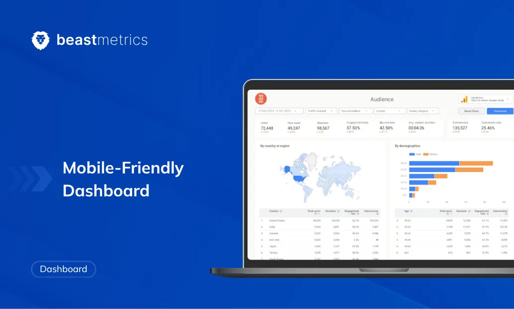
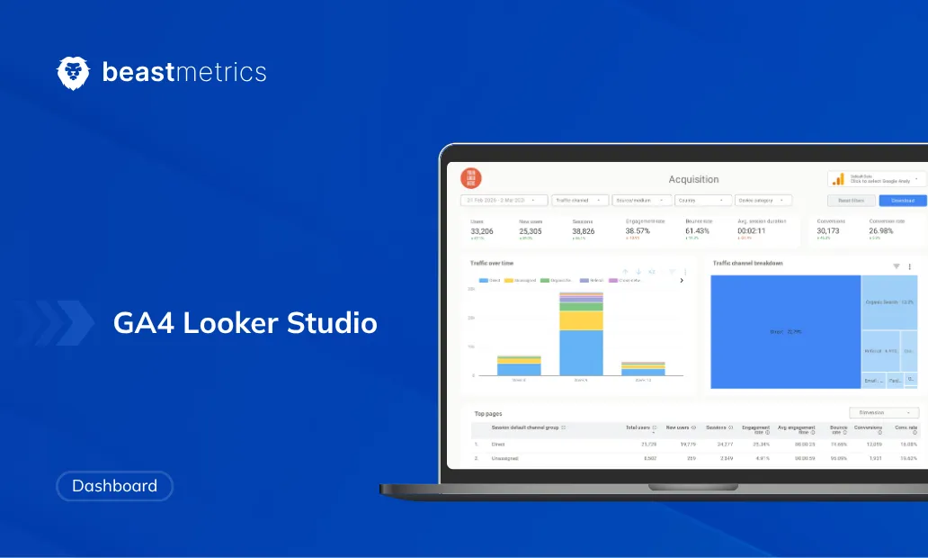
Key Highlights
– Save 10-15 hours per report with proven dashboard fundamentals and templates
– Turn confused clients into strategic partners with clear, actionable visualizations
– Master Google Looker Studio’s free tools without technical expertise
– Apply the “5-chart rule” to prevent overwhelming clients while maintaining focus
– Use business questions (not available data) to build dashboards that drive decisions
Introduction
Three months ago, I was drowning in client reports. Every Monday brought the same nightmare: scattered spreadsheets, endless platform switching, and that sinking feeling when clients asked, “What does this actually mean for our business growth?”
I had all the raw data anyone could want—Google Analytics traffic, Facebook Ads performance, email campaign results. But turning those numbers into something that helped clients make smart decisions? That felt impossible. I’d spend entire mornings building reports that looked professional but left everyone more confused than enlightened.
Then I discovered how proper dashboard fundamentals could transform scattered numbers into clear business insights. The difference wasn’t just better tools—it was understanding how to turn data chaos into stories that drive action.
In this guide, I’ll share the dashboard basics that changed everything for my agency work. Whether you’re struggling with analytics overwhelm or want to create visualizations that actually impress clients, you’ll get a clear roadmap for building dashboards that turn confusion into clarity.
What Makes Dashboards Essential for Modern Marketing
Why Dashboard Basics Matter More Than Ever
Understanding Dashboard Fundamentals
A dashboard is a visual control center that displays your most important business metrics in real-time, designed to help you make decisions quickly. Think of your car’s dashboard—you don’t need every engine detail, but you absolutely need speed, fuel level, and warning indicators at a glance.
The crucial difference between dashboards and reports lies in their purpose. Reports document what happened over specific periods, often in detailed, static formats. Dashboards show what’s happening now and guide what to do next through interactive, updating visualizations.
Why Dashboard Basics Matter More Than Ever
Raw data means nothing without context. You might have thousands of website visitors, but without knowing if that’s up or down, seasonal or trending, converting or bouncing—those numbers provide zero guidance for business decisions.
McKinsey research shows that data-driven organizations demonstrate EBITDA increases of up to 25%. The secret isn’t having more data—it’s turning data into insights faster than competitors.
Modern businesses generate overwhelming amounts of information. Google Analytics 4 tracks over 200 dimensions and metrics, and that’s just website data. Add social media, email platforms, advertising channels, and CRM systems, and you’re drowning in numbers that should guide strategy but instead create paralysis.
Effective dashboards solve this by:
- Eliminating decision delays: Key insights visible instantly, no digging required
- Providing automatic context: Trends, comparisons, and benchmarks built into visualizations
- Aligning team focus: Everyone sees the same metrics, reducing miscommunication
- Highlighting opportunities: Patterns and anomalies that manual analysis might miss
The Step-by-Step Dashboard Creation Process
Dashboard creation process
Here’s the systematic approach I use to build dashboards that actually drive decisions:
Step 1: Start With Questions, Not Data
Every successful dashboard begins with specific business questions you need answered. Before touching any tools, write down exactly what decisions this dashboard should support.
Wrong approach: “Show me all our marketing data” Right approach: “Which campaigns should get more budget next month?”
Common high-value questions for marketers:
- Which traffic sources convert into paying customers?
- What’s our true customer acquisition cost by channel?
- How do seasonal patterns affect our core metrics?
- Which content drives the most qualified leads?
Be ruthlessly specific. Vague goals create confusing dashboards that help nobody make better decisions.
Step 2: Identify Your Essential Data Sources
Once you know your questions, determine what data can answer them. Most marketing dashboards combine:
Website Analytics: Google Analytics 4 for traffic, behavior, and conversion data Advertising Platforms: Google Ads, Facebook Ads, LinkedIn for campaign performance
Email Marketing: Mailchimp, Constant Contact, or HubSpot for engagement metrics CRM Systems: Salesforce, HubSpot, or Pipedrive for lead and customer data Financial Data: Revenue, costs, and profitability numbers from accounting systems
Data preparation saves hours later. Before building visualizations:
- Verify date ranges match across all platforms
- Ensure consistent conversion definitions (what counts as a “lead”?)
- Clean obvious errors like test transactions or internal traffic
- Combine related datasets where logical (ad spend + revenue = ROI)
Start with what you have access to now. Perfect data setups take months, but useful insights can start immediately with available information.
Step 3: Choose Metrics That Drive Action
This separates amateur dashboards from professional tools. Focus on metrics that directly impact business decisions, not impressive-looking numbers.
The 5-7 Rule: Limit main dashboard views to 5-7 core metrics. More creates analysis paralysis. You can always drill down into details when needed.
Essential metric categories:
- Performance indicators: Revenue, conversions, qualified leads
- Efficiency metrics: Cost per acquisition, conversion rates, ROI
- Growth trends: Month-over-month changes, seasonal patterns
- Context metrics: Comparisons to goals, benchmarks, or previous periods
Example marketing dashboard focus:
- Total qualified leads (performance)
- Cost per qualified lead (efficiency)
- Lead-to-customer conversion rate (effectiveness)
- Revenue attributed to marketing (impact)
- Budget allocation by channel (resource optimization)
Ask yourself: “If I could only track five numbers to optimize our marketing, what would they be?” Those become your dashboard foundation.
Step 4: Build Your Dashboard in Google Looker Studio
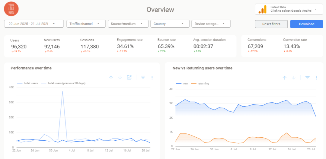
I recommend Google Looker Studio for most marketing dashboards because it’s free, connects directly to popular platforms, and creates professional results without design expertise.
Why Looker Studio excels for marketers:
- Native connectors for Google Analytics, Ads, YouTube, Search Console
- Real-time data updates without manual exports
- Easy sharing via simple links clients can bookmark
- Professional appearance that builds credibility
Step-by-step creation:
Connect Your Data: Visit datastudio.google.com, create a new report, and add your first data source. Start with Google Analytics 4 since most dashboards include website metrics.
Design Your Layout: Place your most important metric prominently at the top. Use the “inverted pyramid” approach—critical insights first, supporting details below.
Add Appropriate Visualizations:
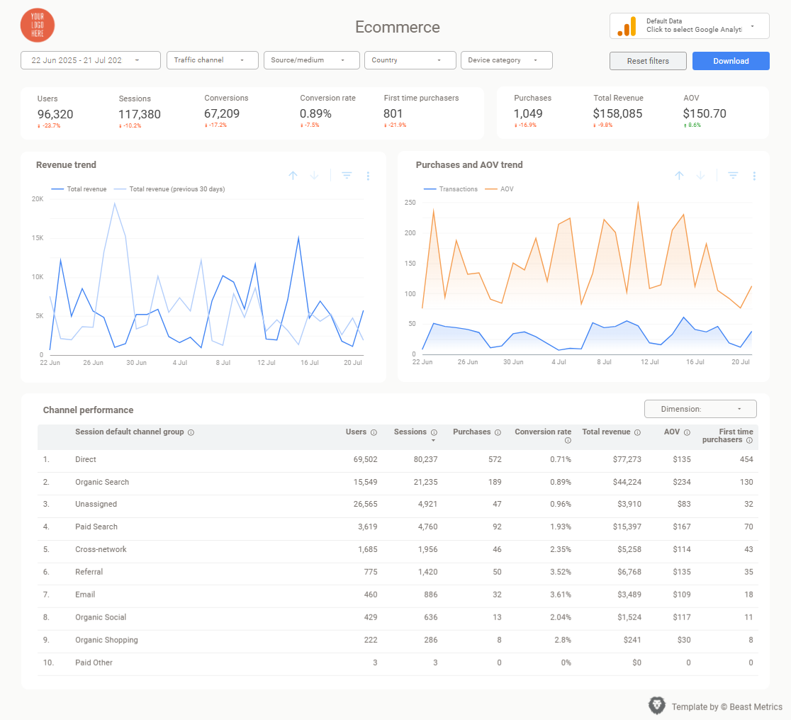
- Single important numbers: Large scorecards
- Trends over time: Line charts
- Channel comparisons: Bar charts
- Proportional breakdowns: Donut charts (limit to 4-5 segments)
Include Interactive Elements: Add date range controls and basic filters. This transforms static displays into exploration tools without overwhelming complexity.
Apply Consistent Design: Use your brand colors, clear chart titles, and logical groupings. Professional appearance builds trust in your data insights.
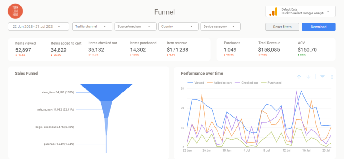
Looker studio dashboard examples
Step 5: Add Context That Creates Understanding
Raw numbers are confusing. Contextualized numbers guide action.
Always include comparisons:
- Previous periods: “15% increase from last month”
- Targets: “85% of quarterly goal”
- Benchmarks: “Above industry average of 2.3%”
Write insights, not just labels. Instead of “Website Traffic by Source,” try “Organic Search Drives 60% of Qualified Leads.” Headlines should communicate findings, not just describe charts.
Example of context transformation:
- Raw: “1,247 website visitors”
- Contextualized: “1,247 visitors (↑23% vs. last month, 94% of monthly target)”
When you spot trends or anomalies, explain them briefly. If mobile traffic spiked but conversions stayed flat, note that and suggest investigating mobile user experience.
Step 6: Test, Refine, and Maintain
Before sharing your dashboard, walk through it with fresh eyes. Can someone unfamiliar with your campaigns understand the main insights quickly? If not, simplify.
Create a maintenance schedule:
- Weekly: Check for data accuracy and unusual spikes
- Monthly: Review metric relevance and add new insights
- Quarterly: Assess whether dashboard still serves original business questions
Foster adoption: Train team members on basic dashboard usage. Tools only provide value when people actually use them for decision-making.
The goal isn’t building perfect dashboards—it’s creating useful ones that improve over time based on how well they support real business decisions.
Dashboard Design Best Practices That Work
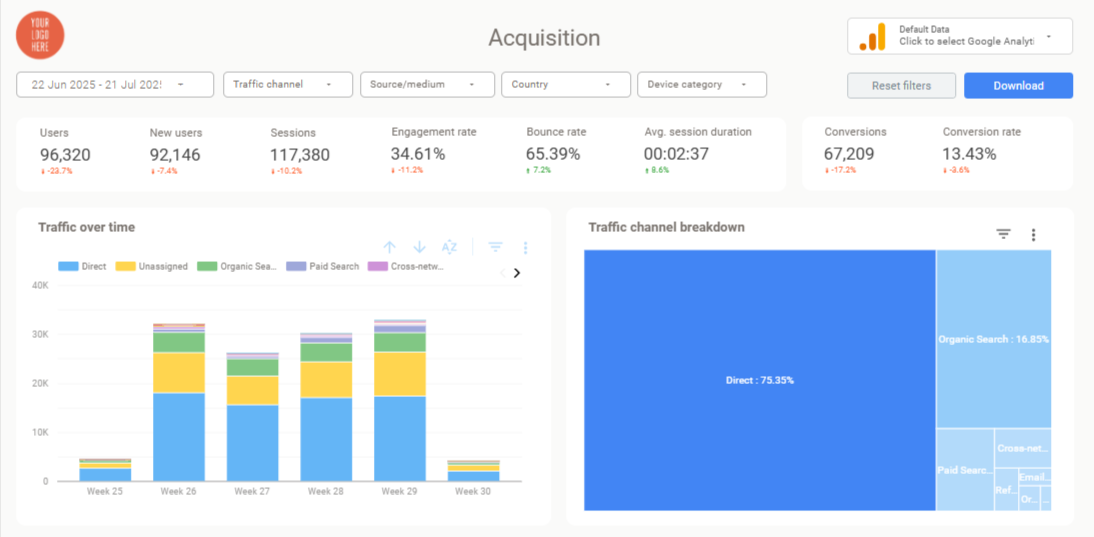
Dashboard Design Best Practices
Keep It Scannable and Focused
White space is your friend. Cramming multiple charts into tight spaces creates visual chaos. Each visualization needs room to breathe and tell its story clearly.
Hierarchy guides attention. Place critical metrics prominently, use size to indicate importance, and group related information logically.
Color communicates meaning. Use consistent colors for categories (all paid channels in blue, organic in green) and warning colors (red/orange) for metrics requiring attention.
Choose Visualizations That Match Your Data
Line charts: Perfect for showing trends over time (traffic growth, conversion rate changes)
Bar charts: Ideal for comparing categories (channel performance, campaign results)
Pie/donut charts: Use sparingly for simple proportions (budget allocation, traffic sources)
Scorecards: Highlight single important metrics (total revenue, conversion rate)
Tables: Include only when precise numbers matter more than visual patterns
Avoid 3D effects, overly decorative charts, or confusing gauge displays. Clarity beats visual flair every time.
Provide Context That Drives Action
Numbers without context create confusion, not insights. Include:
Reference points: Goals, benchmarks, previous periods
Trend indicators: Arrows or color coding for direction
Brief explanations: Why metrics changed and what it means
HubSpot research shows that 94% of marketers say clear visualizations help increase understanding. The secret is context, not complexity.
Make It Interactive (But Not Overwhelming)
Add filters that let viewers explore relevant details:
- Date ranges for different time periods
- Channel filters for specific platform analysis
- Campaign or geographic breakdowns when relevant
Keep interactions simple. The default view should tell your main story without requiring any clicks.
Common Dashboard Mistakes to Avoid
Starting with available data instead of business questions leads to impressive-looking dashboards that don’t help anyone make decisions. Always begin with “What do we need to know?” not “What can we track?”
Including too many metrics overwhelms viewers and obscures important insights. If everything is highlighted, nothing stands out.
Forgetting your audience creates dashboards that don’t match viewer needs. Executives want high-level trends, while campaign managers need operational details.
Ignoring data quality undermines credibility. Wrong numbers presented professionally are worse than rough estimates acknowledged as approximations.
Setting and forgetting allows dashboards to become outdated and irrelevant. Schedule regular reviews to ensure continued usefulness.
Tools and Templates for Faster Results
While Google Looker Studio provides the foundation, pre-built templates can eliminate hours of setup work and ensure you’re tracking industry-standard metrics.
Dashboard templates typically include:
- Pre-configured KPIs for specific industries or platforms
- Professional layouts designed for client presentations
- Built-in best practices for chart selection and organization
- Customizable branding elements
When evaluating template options, look for:
- Integration with your existing data sources
- Flexibility for customization without rebuilding
- Clear documentation and support
- Regular updates for platform changes
How Beast Metrics Supports Your Dashboard Success
One challenge I’ve consistently faced is the gap between generic dashboard tools and the specific needs of marketing agencies. Most solutions offer basic templates that look professional but miss the metrics that actually matter for client relationships and campaign optimization.
Beast Metrics addresses this by providing Looker Studio templates designed specifically for marketing agencies. Instead of starting from scratch or adapting generic business dashboards, you get templates that include the exact KPIs successful agencies track, with client-friendly explanations built into the design.
What makes these particularly valuable is the focus on real agency workflows—tracking multiple client campaigns, demonstrating clear ROI, and maintaining professional branding across all reporting. Our GA4 Dashboard Template transforms 8-12 hours of manual setup into 30 minutes of data connection, while our complete template library ensures you’re measuring what actually drives business results.
Turning Dashboard Basics into Strategic Advantage
Dashboard creation transforms from a technical hurdle into a competitive advantage when approached systematically. The fundamentals we’ve covered—starting with questions, focusing on actionable metrics, and presenting insights clearly—separate effective dashboards from digital decoration.
The key insight is that dashboards aren’t about displaying data—they’re about enabling better decisions faster than competitors. When clients can see exactly how marketing investments drive business growth through clear visualizations, they become partners in optimization rather than skeptics questioning value.
Start simple: pick one important business question, gather the data that answers it, and create a clean visualization that provides context and guides action. Build confidence with basic dashboards before adding complexity.
Your data already contains insights that could transform business performance. Dashboard basics give you the framework to find those insights and present them in ways that drive action rather than confusion.
Whether you build from scratch or leverage templates, the goal remains the same: turning data chaos into strategic clarity that grows businesses and strengthens client relationships.