Key Highlights
• Data reporting bridges the gap between raw analytics and actionable business insights for marketing teams
• Automated reporting tools can save agencies 10+ hours per week compared to manual spreadsheet processes
• Client-focused reports should emphasize ROI metrics and include brief explanations rather than technical jargon
• Visual dashboards increase report comprehension by 65% compared to text-heavy documents
• Template-based reporting ensures consistency while allowing customization for different client needs
Introduction
“What if I told you that every successful marketer has had that exact moment of panic staring at spreadsheets, wondering how to make sense of it all?”
I remember the first time I had to present a marketing report to a client – I had dozens of Excel sheets open, a knot in my stomach, and absolutely no idea how to turn those endless rows of numbers into something that would actually help my client understand their campaign performance. The data was all there, but transforming it into a story that my client would value (and pay for) felt like trying to solve a puzzle with half the pieces missing.
If you’ve ever felt overwhelmed by analytics dashboards or struggled to explain campaign results to a client, you’re definitely not alone. According to a recent HubSpot study, 77% of marketers struggle with data sharing across teams, highlighting just how common these reporting challenges really are.
“Data reporting is the process of turning raw numbers into meaningful insights” – is the compass for modern marketing decisions. In this beginner-friendly guide, we’ll demystify data reporting, show you how to create reports that impress (and inform) your clients, and share practical tips I’ve learned from years of marketing reporting – including the shortcuts that can save you hours every month.
We’ll cover what data reporting actually means, why it’s critical for agencies, the step-by-step process to create effective reports, and how to leverage tools like Google Looker Studio to make the whole process easier and more professional.
What Is Data Reporting (and Why Should Marketers Care)?
Definition of Data Reporting
Data reporting is the process of collecting and converting raw data into an easily understandable format (like charts, tables, or dashboards) to help inform decision-making.
In other words, it’s how you go from messy spreadsheet data to a clear story about your marketing performance.
The key difference between data reporting and data analysis is focus: reporting presents what’s happening in a digestible format, while analysis digs into why metrics are trending a certain way. Both work hand-in-hand, but reporting focuses on clear communication of results rather than deep investigation.
Why Data Reporting Matters for Agencies & Marketers
Understanding what is data reporting is just the first step – here’s why it’s become essential for marketing success:
It proves ROI to clients and stakeholders – Data reports show exactly what results your campaigns drive, building trust and justification for your marketing spend. When clients can see concrete numbers tied to their business goals, they’re more likely to continue (and increase) their investment.
It guides smart decision-making – With regular reports, you can see what’s working and adjust campaigns on the fly. For instance, a report might reveal that one ad channel yields a much lower cost-per-acquisition than another, telling you exactly where to allocate next month’s budget.
It aligns teams and clients – Reports create a single source of truth, getting everyone on the same page. Instead of each team working with siloed data, a well-done report eliminates confusion and reduces those endless email chains asking “what were last month’s numbers again?”
It saves time in the long run – Although setting up good reporting takes initial effort, it prevents the chaos of last-minute number crunching. According to research, companies with strong data reporting practices can reduce marketing costs by up to 30% through better resource allocation.
It uncovers trends and opportunities – By looking at data over time through monthly reports, you might spot patterns like conversion rates spiking on weekends, giving you actionable insights to capitalize on.
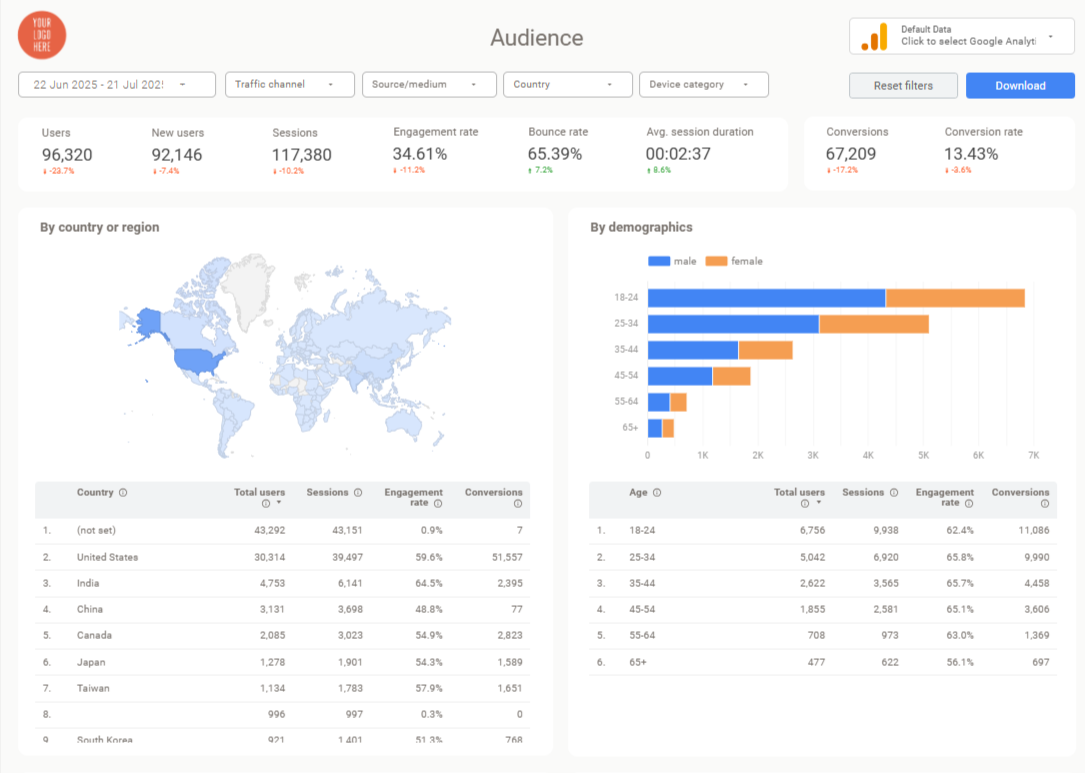
Types of Data Reports You Might Create
Understanding the different types of data reports helps you choose the right format for each situation. Here are the most common marketing data reporting formats agencies use:
Campaign Performance Reports focus on specific marketing initiatives, covering KPIs like impressions, clicks, conversions, and cost-per-conversion. These are perfect for reviewing how a particular ad campaign or marketing push performed over its duration.
Channel Reports dive deep into single marketing channels – think SEO reports, PPC reports, or social media analytics. Each focuses on platform-specific data, which is helpful when you have specialists managing different channels or when clients want detailed insight into specific areas.
Executive Marketing Dashboards provide high-level metrics across all channels, perfect for C-suite stakeholders who need the big picture without getting lost in granular details. These typically include overall ROI, customer acquisition costs, and revenue attribution.
Real-Time vs. Static Reports serve different purposes: real-time dashboards (built in tools like Google Looker Studio) update continuously and can be checked anytime, while static reports (PDFs or PowerPoints) capture specific time periods. Many agencies now provide both – a live dashboard for ongoing monitoring plus monthly static summaries.
Ad Hoc Reports address specific questions that come up, like “Why did website traffic drop last week?” These one-off analyses help investigate anomalies or explore new opportunities outside your regular reporting schedule.
Essential Elements of Effective Data Reports
Before diving into creation steps, let’s understand what makes a marketing data report actually useful:
Key Metrics and KPIs should focus on what matters most for the campaign or client goals. Choose 5-10 core metrics rather than overwhelming readers with every available data point. For lead generation campaigns, prioritize metrics like leads generated, cost per lead, and conversion rates.
Clear Data Visualization transforms raw numbers into instant understanding. Use line charts for trends over time, bar charts for comparisons between channels, and pie charts for budget breakdowns. The right chart type makes data immediately actionable.
Narrative and Context separate good reports from great ones. Every significant metric should include brief interpretation – instead of just showing “conversions dropped 10% in March,” explain why: “Conversions dipped 10% in March due to reduced ad spend during budget reallocation, but cost-per-conversion improved by 15%.”
Comparisons and Benchmarks give metrics meaning. Include month-over-month comparisons, year-over-year trends, or industry benchmarks so readers instantly know whether results are good or concerning.
Actionable Recommendations transform reports from passive documentation into strategic tools. End each section with next steps: “Based on the strong performance of the retargeting campaign, we recommend increasing its budget by 25% next month.”
How to Create a Data Report (Step-by-Step)
Now let’s walk through the practical process of building effective marketing data reporting from scratch:
Step 1 – Define the Report’s Purpose and Audience
Before pulling any data, clarify why you’re creating this report and who will read it. Are you building a monthly client report to demonstrate ROI? An internal report to optimize campaigns? The purpose determines which metrics to prioritize.
Consider your audience’s needs: a client CEO might only care about overall sales and cost-per-acquisition, while your internal campaign manager needs granular CTR and keyword performance data. For example, executive reports should be high-level and visual, while operational reports can include more detailed breakdowns.
Step 2 – Gather and Prepare Your Data
List all your data sources: Google Analytics 4 for website traffic, Google Ads and Facebook Ads for campaign data, your CRM for lead and sales information. Ensure you have access to everything before starting.
Check for anomalies or missing data during your specified reporting period. It’s crucial to maintain consistent date ranges and attribution definitions across platforms – if “conversion” means form submissions in Google Ads, use that same definition throughout your report.
Time-saving tip: Use automated connectors when possible. Tools like Google Looker Studio’s native connectors or data integration platforms can pull information directly, eliminating manual CSV exports and reducing errors.
Step 3 – Select Key Metrics (Don’t Measure Everything)
Focus on 5-10 metrics that directly relate to your campaign objectives. Here are common metric sets by goal:
For digital marketing campaigns: Spend, Impressions, Clicks, Conversions, Conversion Rate, Cost per Conversion, Revenue (if trackable), ROAS
For website/SEO performance: Sessions, Users, Bounce Rate, Session Duration, Goal Completions, Top Traffic Sources
Avoid vanity metrics that don’t tie to business objectives. Page views might look impressive, but if your goal is lead generation, focus on how many of those page views converted to actual leads.
Step 4 – Choose Visualization and Format
Decide how you’ll present the report: a client-friendly PDF, an Excel workbook, or an interactive dashboard. Many agencies now use Google Looker Studio for its transparency and real-time updates, though some clients still prefer PDF summaries.
For visualizations, match chart types to data types: line charts for trends, bar charts for comparisons, donut charts for proportional breakdowns. Keep layouts clean with 2-4 charts per page and ensure your agency’s branding is consistent throughout.
Pro tip: Many agencies provide both a live dashboard link for ongoing monitoring and a monthly PDF summary highlighting key insights.
Step 5 – Add Insights and Context
This is where reporting becomes truly valuable. For each major finding, write a brief interpretation explaining what the data means and why it matters.
Use this format: Insight → Because → Action.
For example: “Conversion rate increased from 3% to 4.2% in April because we implemented new landing page designs based on user feedback.
Action: Apply the same design principles to our underperforming product pages.”
Be transparent about negative results too. If performance declined, explain the context and your plan to address it. Clients appreciate honesty and proactive solutions over sugar-coated reporting.
Step 6 – Review, Deliver, and Automate
Before sending your report, do a thorough accuracy check. Have a colleague review it if possible – if they get confused by any section, your client likely will too.
For delivery, consider your client’s preferences. Some prefer email attachments, others like dashboard links, and many appreciate a brief presentation call to discuss insights and next steps.
Set up automation where possible: schedule your Google Looker Studio dashboard to email PDF summaries monthly, or use calendar reminders for manual report preparation. The goal is creating a sustainable system that doesn’t require rebuilding from scratch each cycle.
Marketing Reporting Best Practices
Here are essential do’s and don’ts for creating reports that actually get read and acted upon:
Do’s:
Keep it Simple – Highlight the metrics that matter most. A clear, focused report beats overwhelming clients with every available data point.
Use Visuals Strategically – Charts tell stories at a glance, but ensure each visualization is intuitive and properly labeled. Avoid cryptic chart titles that require explanation.
Provide Context Always – Explain significant changes with brief annotations. Include comparisons to previous periods so readers immediately understand whether metrics are improving or declining.
Tell a Data Story – Structure reports logically, perhaps starting with high-level KPIs then diving into channel-specific performance. Lead with key insights so even time-pressed readers get the main message.
Be Honest and Proactive – If something underperformed, acknowledge it and explain your improvement plan. Clients value transparency and solutions over excuses.
Don’ts:
Don’t Overwhelm with Data – Including 50+ metrics confuses rather than clarifies. Focus on insights, not volume.
Don’t Use Unexplained Jargon – Not everyone knows what “CTR” or “ROAS” means. Either use plain language or include brief definitions.
Don’t Present Data Without Interpretation – Raw charts without commentary miss opportunities to guide decision-making. Always spell out what the data suggests.
Don’t Forget Visual Design – Ugly, hard-to-read reports reflect poorly on your professionalism. Clean layouts with consistent branding show attention to detail.
Tools and Templates for Easier Data Reporting
The good news is you don’t have to build everything manually. Here are the most effective tools for streamlined marketing data reporting:
Google Looker Studio (formerly Google Data Studio)
Looker Studio is ideal for agencies and marketers because it connects to major data sources (Google Analytics, Ads, YouTube, spreadsheets) and creates interactive dashboards that update automatically. It’s completely free and allows easy sharing via simple links.
One huge advantage is the template ecosystem – you can use pre-designed report templates tailored for specific platforms rather than building dashboards from scratch. For example, Looker Studio templates for Google Ads, Facebook Ads, or GA4 come with all the essential charts and KPIs already configured. You simply connect your accounts and get professional reports instantly.
Templates typically save dozens of hours per setup and ensure you’re tracking industry-standard metrics. They’re also customizable, so you can add your branding and adjust sections for specific client needs.
Other Helpful Tools
Google Analytics 4 provides built-in reports and exploration tools for website data, though you’ll likely want to combine this with other sources in Looker Studio for comprehensive reporting.
Excel/Google Sheets still work for custom analysis, especially when platforms don’t integrate directly. However, manual updating becomes tedious for recurring reports.
Automation connectors like Zapier can move data between systems automatically, reducing manual export work and ensuring data stays current.
The key is choosing tools that minimize manual work while maintaining data accuracy and professional presentation.
AI in Data Reporting: The Future is Here
Artificial intelligence is transforming how we approach marketing data reporting, making insights more accessible and actionable than ever before.
Automated Insight Generation is becoming standard in modern reporting platforms. AI can now analyze your data patterns and automatically highlight significant changes, anomalies, or opportunities you might miss in manual reviews.
Natural Language Processing allows you to query data using plain English. Instead of building complex reports, you might soon ask “How did our Facebook campaigns perform last month compared to Google Ads?” and receive instant, formatted responses.
Predictive Analytics helps forecast future performance based on current trends, enabling more strategic planning. AI can suggest budget allocations or identify which campaigns are likely to hit their targets.
While AI enhances reporting capabilities, human insight remains crucial for strategy and client communication. The best approach combines AI-powered efficiency with human interpretation and relationship management.
Why Beast Metrics Stands Out in the Reporting Space
In my experience working with various reporting solutions, I’ve found that most companies offer one-size-fits-all dashboard templates that don’t quite address the real challenges agencies face. However, Beast Metrics takes a refreshingly different approach by actually understanding how marketing agencies operate day-to-day.
Our Looker Studio templates solve the specific headaches I’ve encountered countless times: explaining results to non-technical clients, tracking multiple campaigns simultaneously, and maintaining professional branding across all reports. What I’m particularly proud of is that each template comes with the exact KPIs agencies actually use (not just vanity metrics), includes client-friendly explanations built right in, and offers genuine customization without requiring you to rebuild everything from scratch.
Instead of forcing you to change your workflow to match our system, we’ve designed our templates around how successful agencies already work – which is why they feel so intuitive and deliver immediate results from the first use.
Conclusion – Turn Data into Action (and Results)
Data reporting transforms from an overwhelming chore into a powerful business tool when you approach it strategically. We’ve covered the fundamentals of what data reporting means, why it’s essential for marketing success, and exactly how to create reports that drive decisions rather than collect dust.
Remember, the goal isn’t creating perfect charts – it’s generating understanding that leads to better campaigns and stronger client relationships. When your client has that “aha” moment because of insights in your report, you know you’ve succeeded.
Start with the basics: define clear objectives, focus on metrics that matter, and tell the story behind your numbers. As you build confidence, explore automation tools and templates that can streamline your workflow while maintaining professional quality.
Your data is only as valuable as the insights you extract from it. Now you have the roadmap to transform those scattered analytics into strategic advantages that grow businesses and build lasting client partnerships.